00
.
CASE STUDY
OVERVIEW
How UX fixes in a complex, error-prone journey boosted adoption of a key add-on and helped reduce churn for Flowbox clients.


What if your most advanced feature was actually causing silent churn among your best clients?
That was the case at Flowbox, a User Generated Content (UGC)-powered E-commerce Marketing Platform used by top retail brands across Europe.
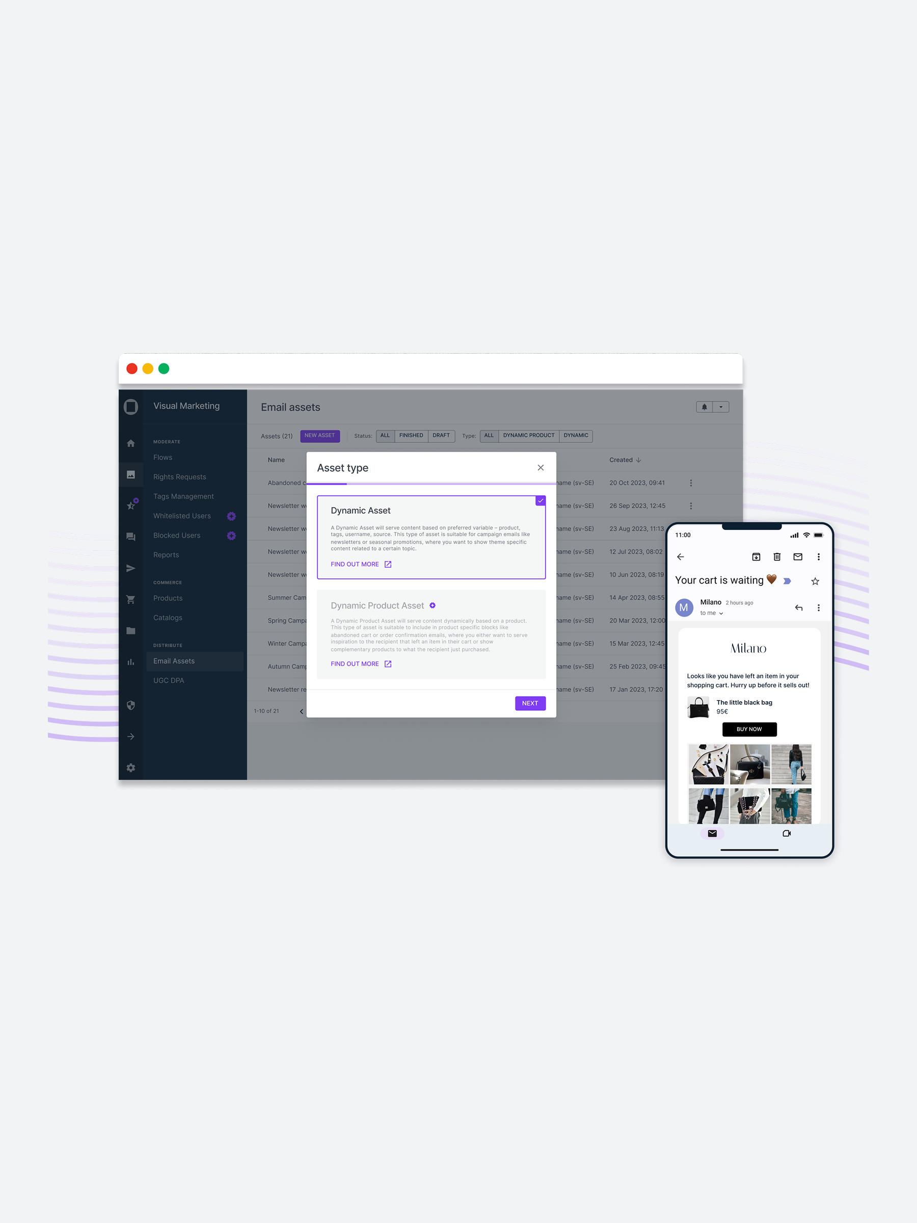
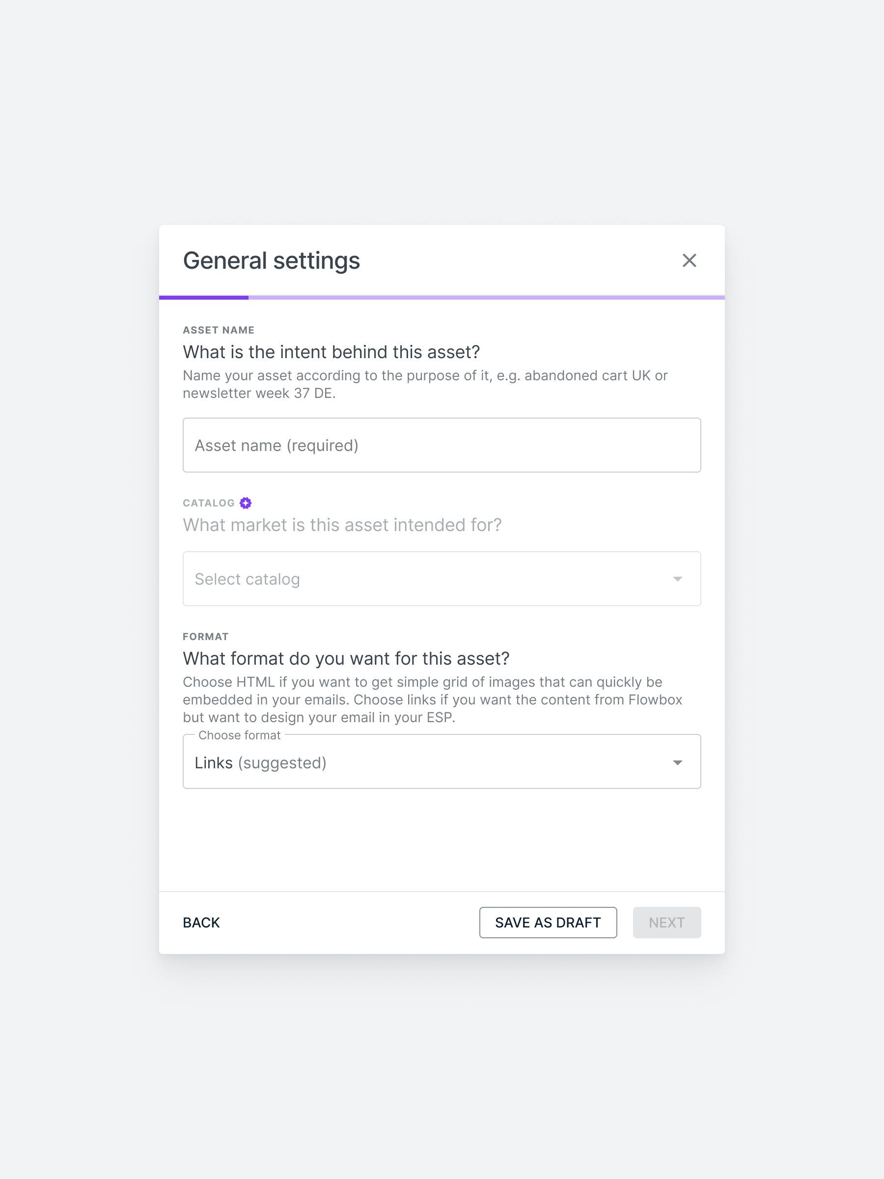
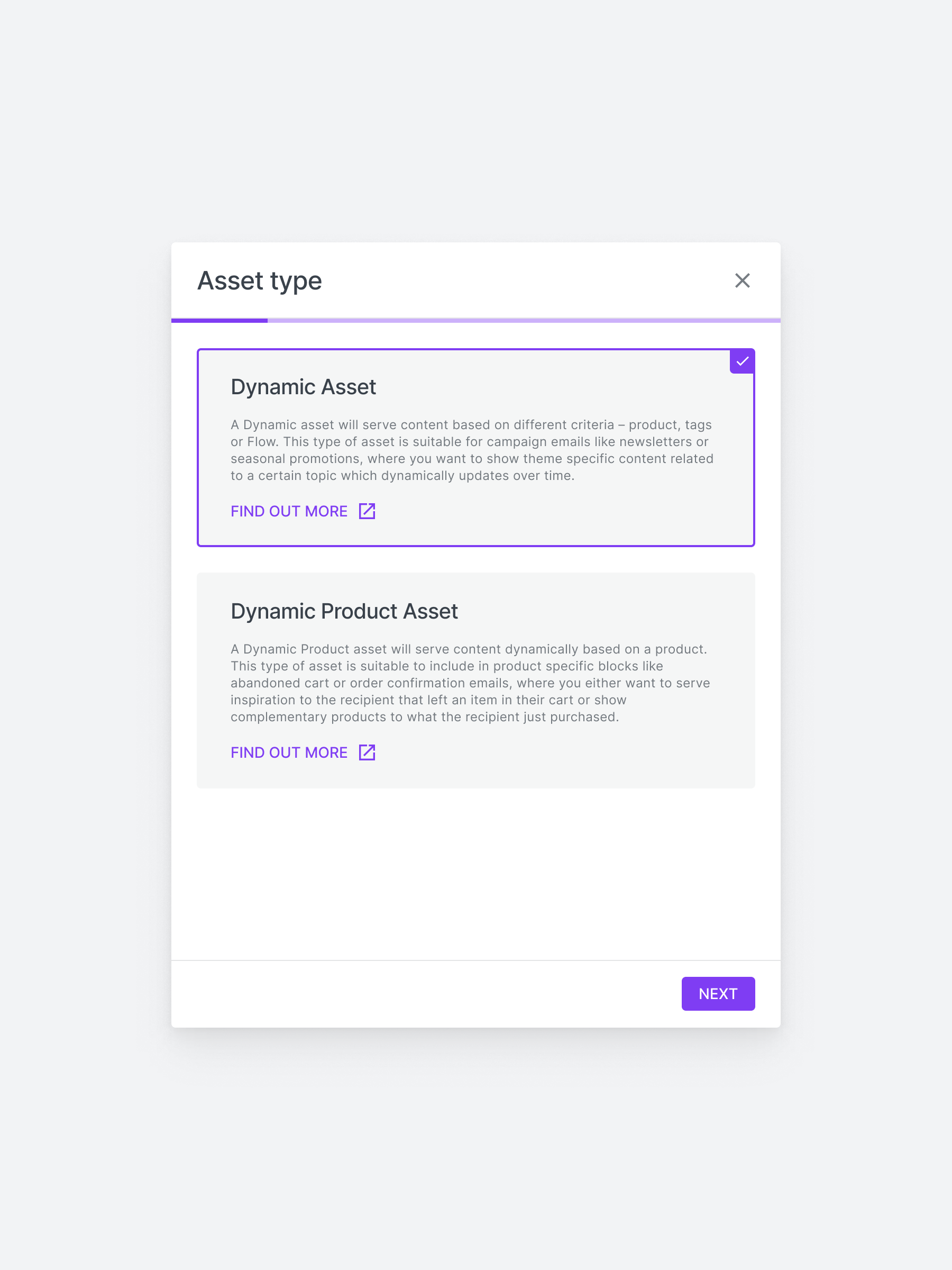
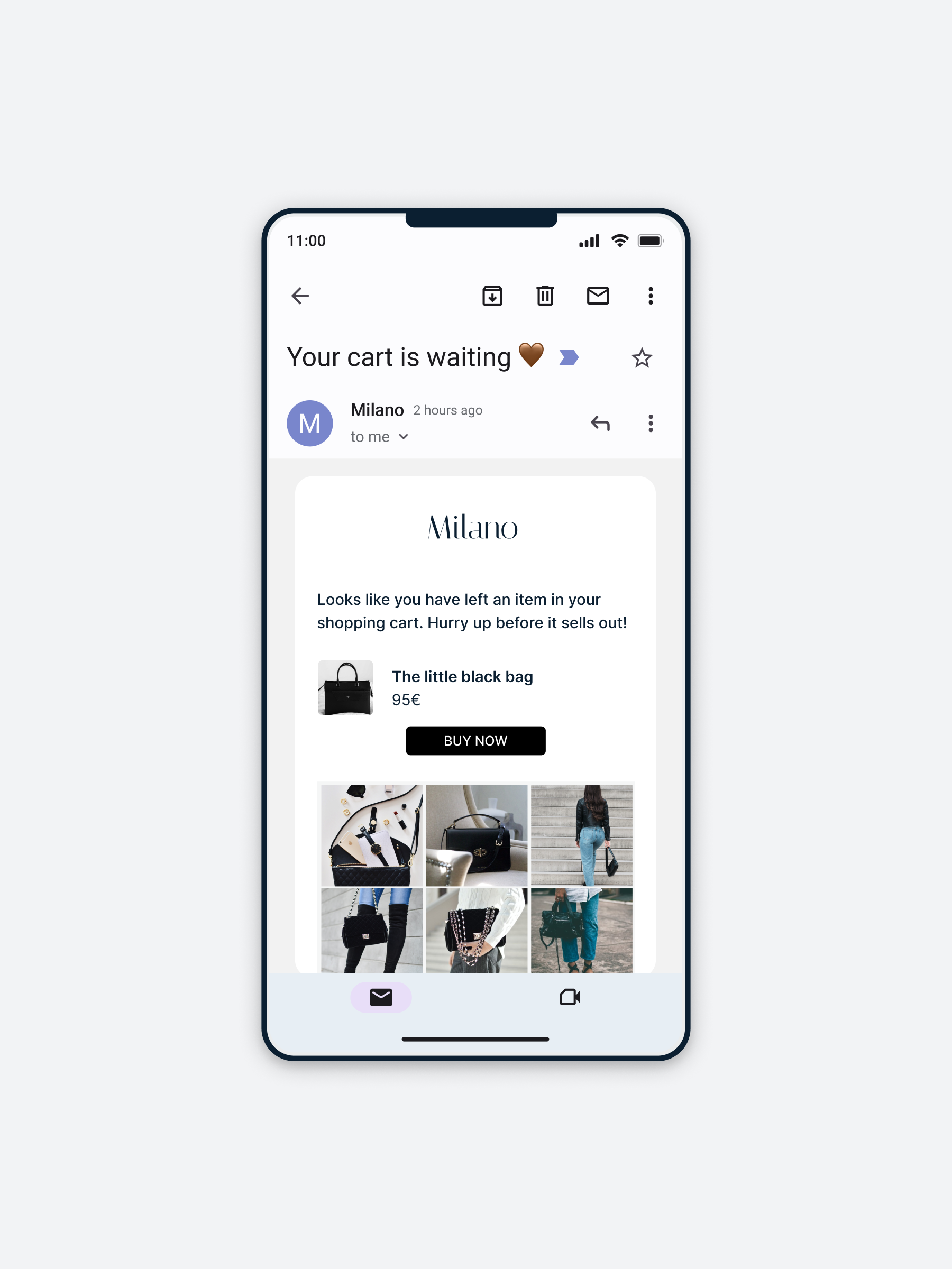
The Email Assets feature — designed to help clients dynamically embed curated content in high-converting emails like abandoned cart and product recommendations — was powerful in theory, but plagued by broken flows, poor error handling, and unclear setup steps. Despite being a Premium add-on, it was underused and quietly driving churn.
As a Product Designer, I took ownership of this complex workflow. By collaborating with PMs, support, and developers, I mapped the full user journey, uncovered root issues, and introduced critical UX fixes, validation logic, and small-but-mighty improvements.
In under 3 months, these UX fixes made the feature usable again — reducing churn, boosting adoption, and cutting support escalations across Premium clients.
Fewer drop-offs among Premium users after fixes to key blockers and broken flows.
Adoption rose from ~35% to 55% after UX fixes, better validation, and clearer steps.
Support tickets related to Email Assets dropped by ~35% following UX improvements and better validation.
Disclaimer: This case study reflects my personal experience as Product Designer at Flowbox. All impact metrics shown are based on internal observations and anecdotal feedback, and do not represent official company-released data or views.
Flowbox’s Email Assets was powerful in theory — enabling brands to embed fresh UGC in high-converting emails like abandoned cart and product recommendations. But in practice? It was barely used.
The result? Struggling to gain traction with high-value clients and quietly driving churn.
The challenge:
How might we uncover and fix usability gaps in this complex journey — without rebuilding the feature — to reduce churn and drive meaningful adoption?
"Our best clients are paying for this — they should be using it."
What that meant in practice:
• Increase adoption of Email Assets across Premium accounts
• Reduce the need for support escalations
• Justify the value of the Premium plan by improving activation
• Avoid a costly rebuild by addressing usability at the UX layer
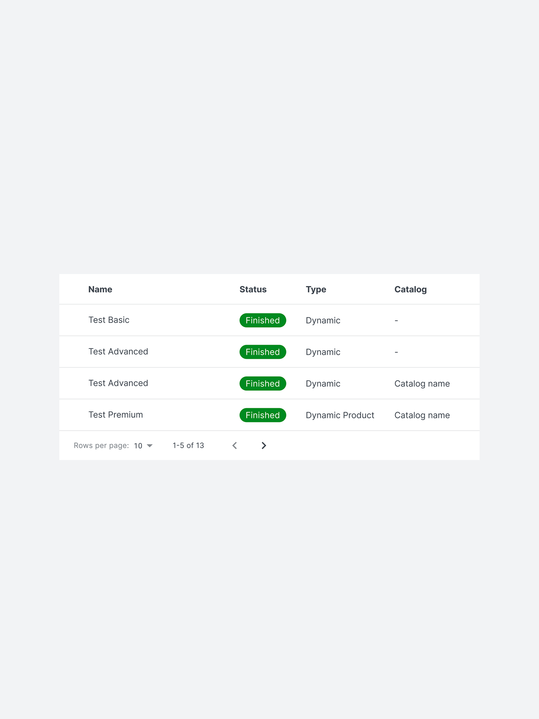
After mapping every possible path in the Email Assets journey and analyzing common issues flagged by support and CSMs, three core blockers emerged:
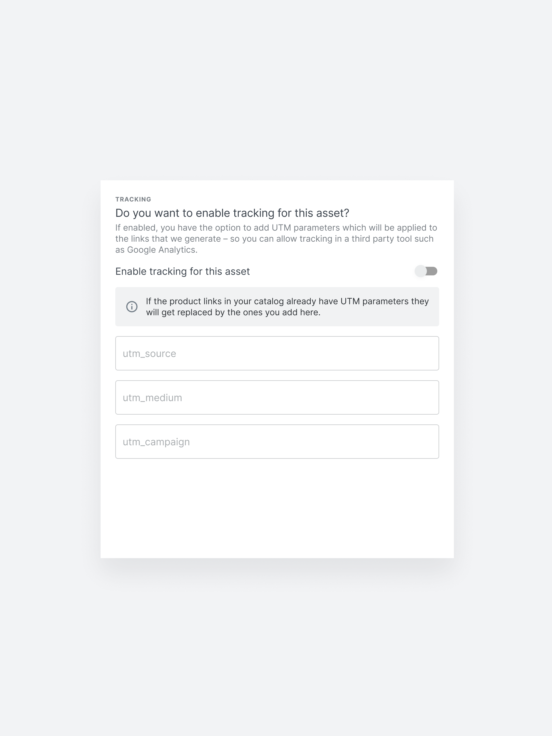
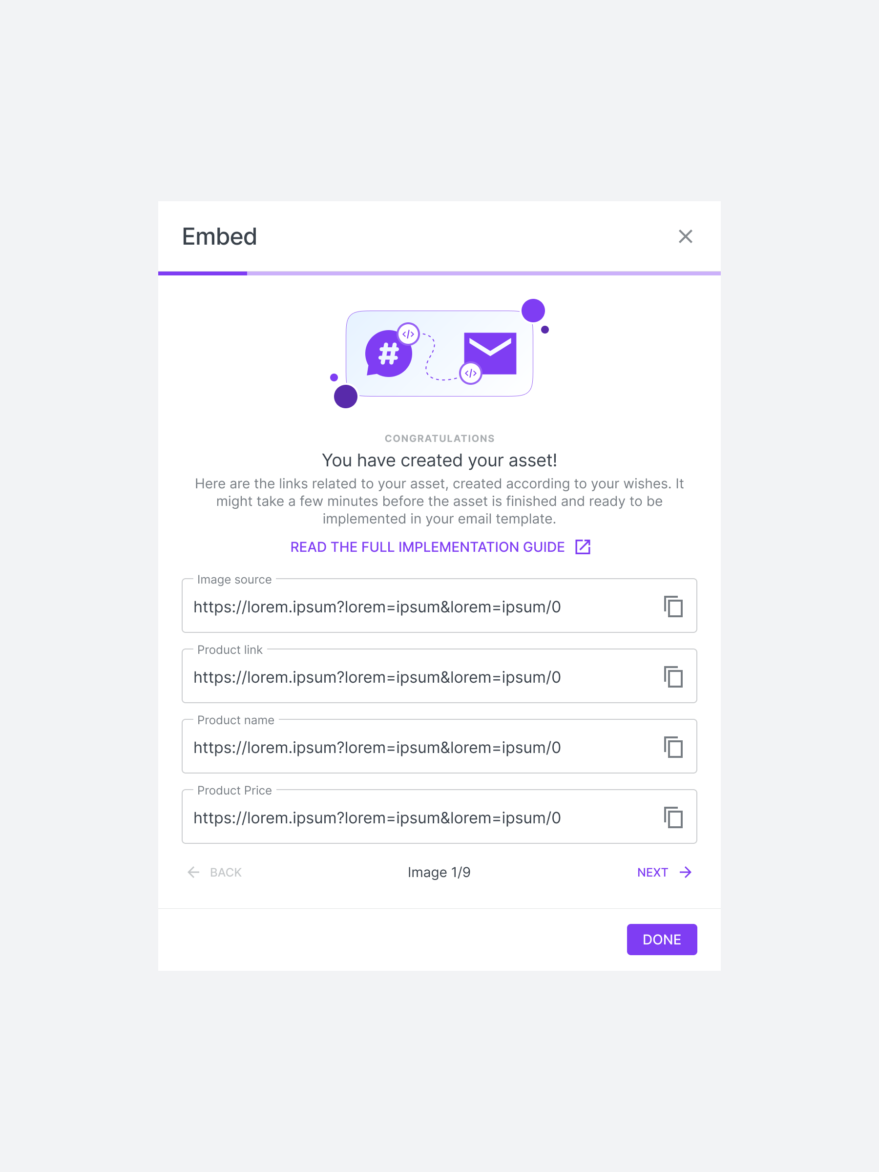
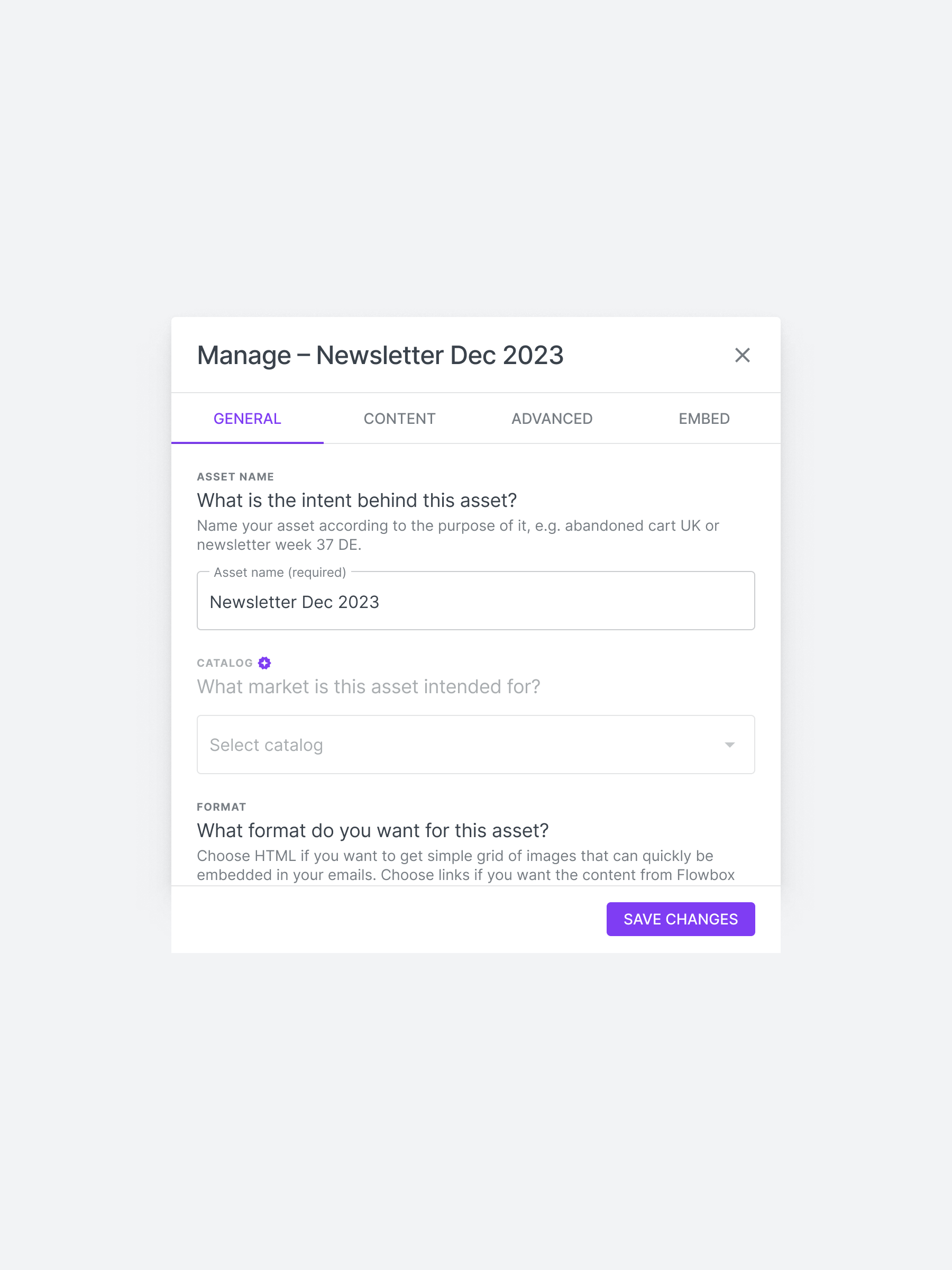
Users could submit broken assets without knowing it. No inline errors. No confirmations. Just broken output.
From asset types to fallback logic to dynamic variables — it was unclear what was required and why.
There was no guidance for new users, and existing ones got stuck trying to edit or preview their assets.
Many premium clients weren’t using the Email Assets feature at all; not because they didn’t need it, but because the setup flow was confusing, lacked validation, and offered no feedback or error handling. The result? Broken emails, frustrated users, and silent churn.
I collaborated with cross-functional stakeholders to align on priorities, feasibility, and customer impact:
• Product Manager – Set business goals, provided roadmap context and prioritized adoption-focused improvements
• CTO – Advised on technical feasibility and resource constraints
• Customer Success & Support Leads – Flagged recurring client issues and helped validate pain points
As the Product Designer, I owned the UX discovery and redesign of the Email Assets workflow. I led the effort to untangle this complex flow, partnering cross-functionally to deliver an improved experience that would drive retention and reduce manual intervention.

I worked in a lean, cross-functional team:
• 1 Product manager
• 1 other product designer
• 5 Developers
• Customer Success & Support
• Chief Technical Officer

I led the end-to-end UX for this project and:
• Rebuilt the Email Assets journey to spot blockers
• Mapped key pain points from support and CSM insights
• Worked with engineering to scope and QA fixes
• Prototyped and iterated on key UX improvements
• Delivered dev-ready specs and supported implementation
• Ran design syncs and aligned with product stakeholders
This was a high-impact, UX-led rescue of an advanced but neglected feature. I focused on making Email Assets usable, discoverable, and worth upgrading for — all within 3 months, no extra dev headcount, and limited data. Success meant reducing churn and support strain without needing a rebuild.
.png)
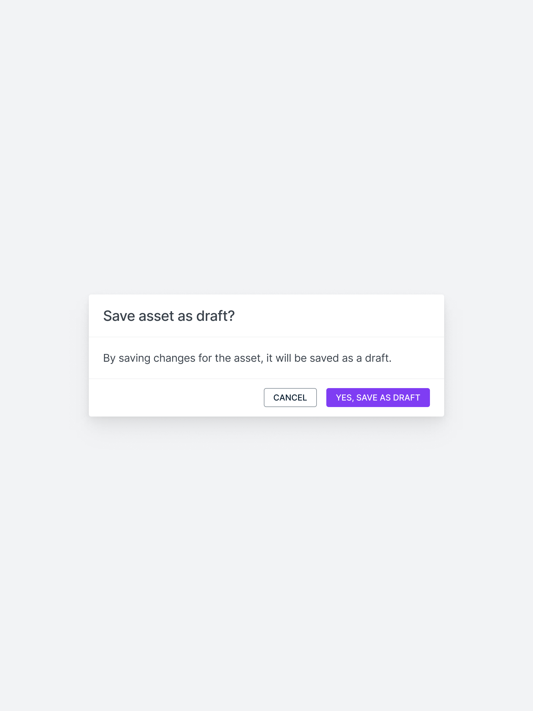
I had under 3 months to identify issues, design solutions, and ship improvements — all while juggling other high-priority projects and racing against upcoming contract renewals that risked churn.

Due to time and resource constraints, we couldn’t conduct user interviews or usability tests. All insights came from indirect signals like support tickets, CSM feedback, and internal discussions.

The feature had no event tracking in place. We couldn’t measure exact adoption or churn impact pre-fix, which made post-launch impact anecdotal rather than data-backed.

Certain usability issues couldn’t be fixed due to tech debt or backend limitations. All improvements had to work within the existing structure, without triggering a full rebuild.
With no analytics or user interviews available, I took a triangulated approach to uncover the root issues:
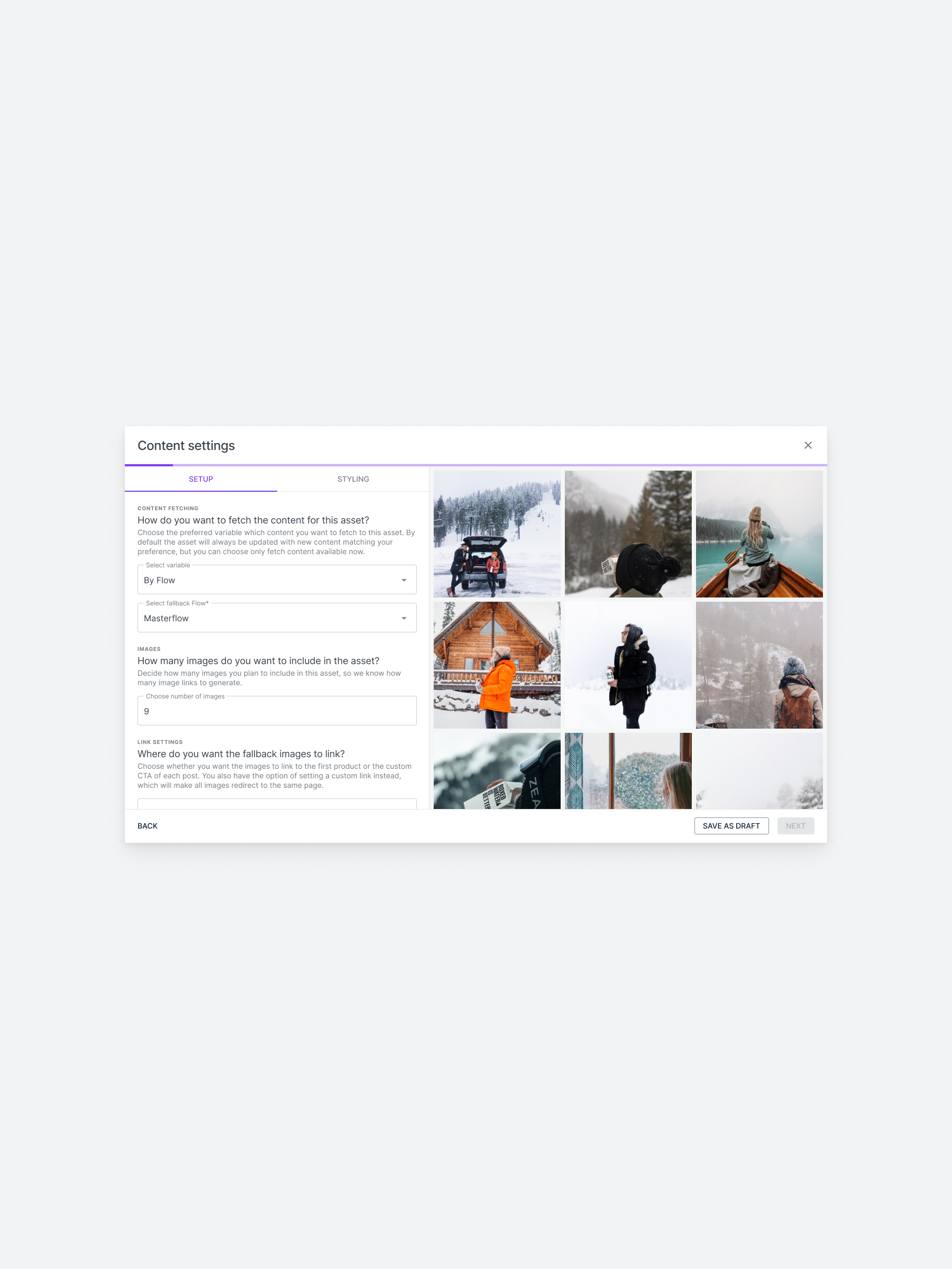
1) Remapped the full UX journey: I manually replicated every user flow for creating and managing Email Assets — from both Dynamic and Product Dynamic asset types — across all plan levels (Advanced and Premium). This allowed me to pinpoint exactly where the experience broke down.
2) Analyzed support & CSM insights: I partnered with Customer Support and CSM teams to surface high-friction pain points directly impacting adoption and retention. Their input revealed consistent complaints, silent errors, and unclear expectations from clients.
3) Audited the interface & micro-interactions: I performed a UI/UX teardown to identify missing validations, dead ends, broken CTAs, and modals without feedback — all critical blockers to successful asset creation.
This bottom-up audit, combined with cross-functional discovery, enabled me to identify the 7 most urgent UX issues — all without direct user testing or tracked analytics.

Design Focus Area #1
Many users didn’t realize they were using premium features.
→ Design upgrade prompts that clearly highlight premium benefits at the moment of need.
Design Focus Area #2
The manual, sales-dependent process slowed users down.
-> Build a seamless in-app upgrade flow that eliminates delays and removes sales dependencies.
Design Focus Area #3
Free users stayed indefinitely because limits weren’t clear or enforced.
-> Design hard and quota-based gates that communicate limits, reinforce value, and nudge upgrades at the right time.

❌ Users didn’t realize which features were premium.
❌ Upgrade flows felt too manual and high-friction.
❌ Gating was inconsistent or missing altogether.

#01. Clarify Premium Value: contextual nudges & visual cues.
#02. Reduce Upgrade Friction: a guided in-app flow
#03. Strengthen Feature Gating: soft walls, quotas & daily limits

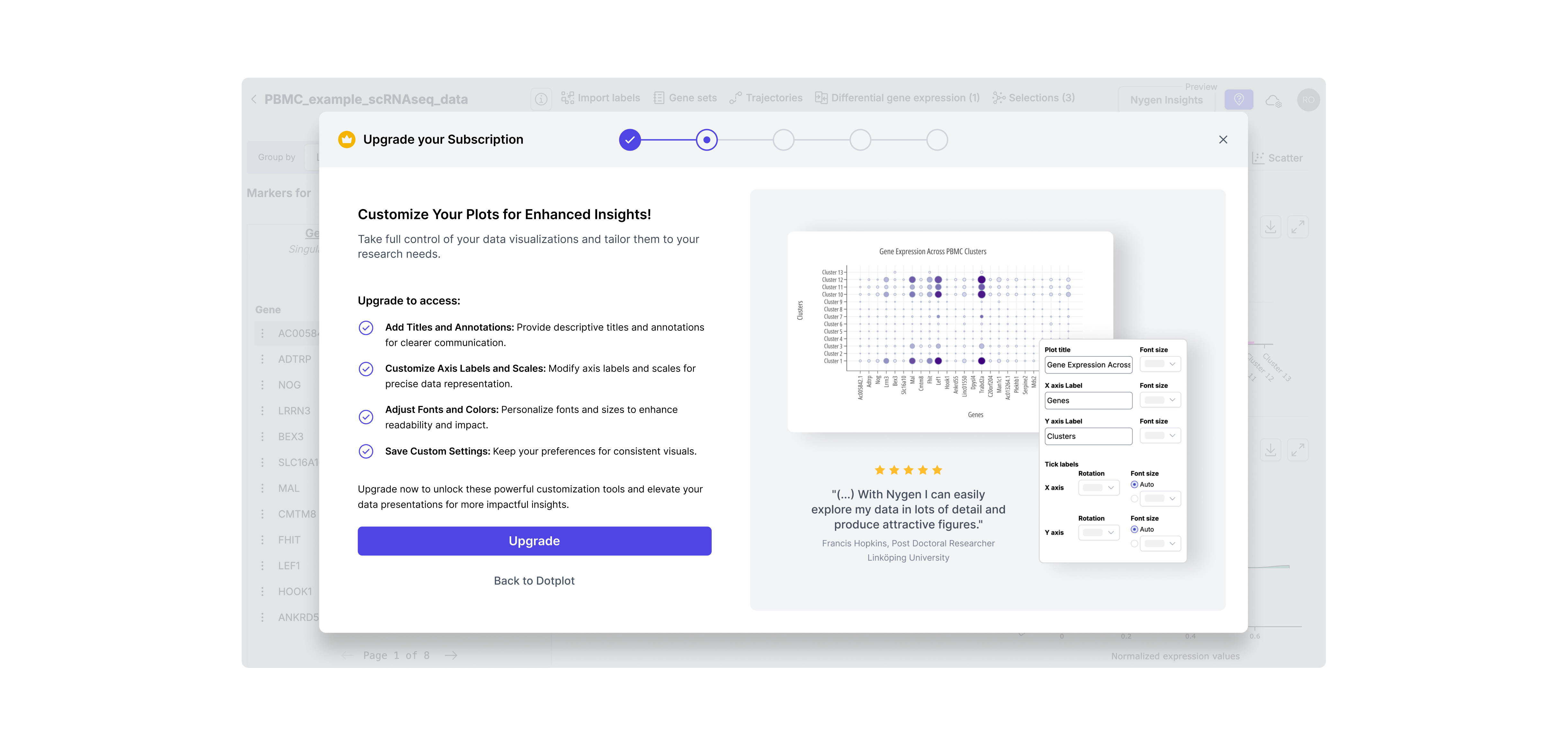
Many users didn’t even realize they were using premium features. To address this, I introduced soft paywalls, in-context upgrade nudges, and visual cues that helped users recognize value at the exact moment of interaction — without interrupting their flow or creating frustration.

Before
Free users could access advanced insights like cluster alternatives and supporting markers — without realizing these were premium features. This lack of visibility made upgrades unlikely, since users didn’t understand what value they were getting for free — or what they’d gain by paying.

After
A soft paywall now highlights premium content with subtle overlays and upgrade prompts. This approach clearly signals value without blocking access, helping users understand what’s included in their plan and nudging them toward upgrading at the right moment.
Previously, upgrading required users to email support, wait days, and manually submit payment details — a process full of drop-off points. I replaced this with a guided, in-app upgrade flow that let users select a plan, input payment, and gain access instantly — all without leaving the product.
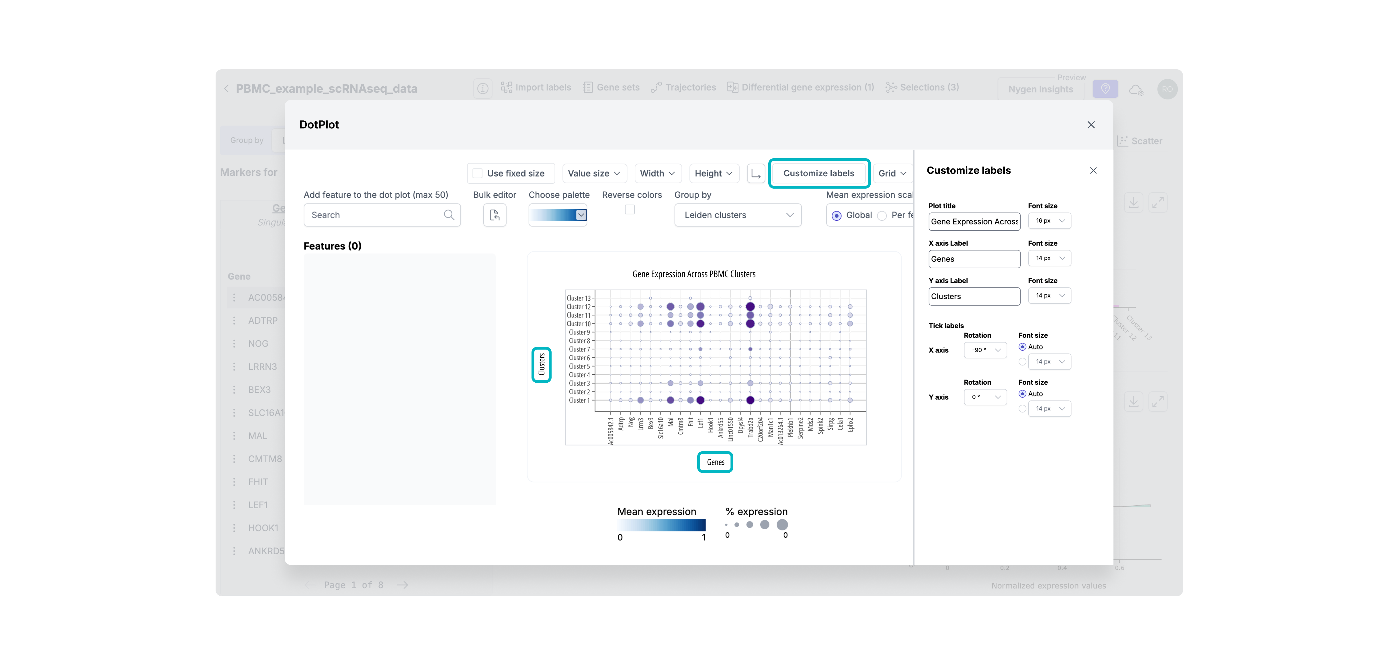
Step 1. Highlighting Premium Features
To help users recognize premium functionality before hitting a hard wall, I added soft visual indicators (like the crown icon) on premium actions. This created early awareness of value and primed users for the upgrade flow without interrupting their workflow.
Step 2. Contextual Upgrade Modal
Instead of generic upgrade CTAs, I designed contextual modals triggered at the moment of intent. This ensured the upgrade pitch was relevant, well-timed, and directly tied to the feature the user just tried to access.
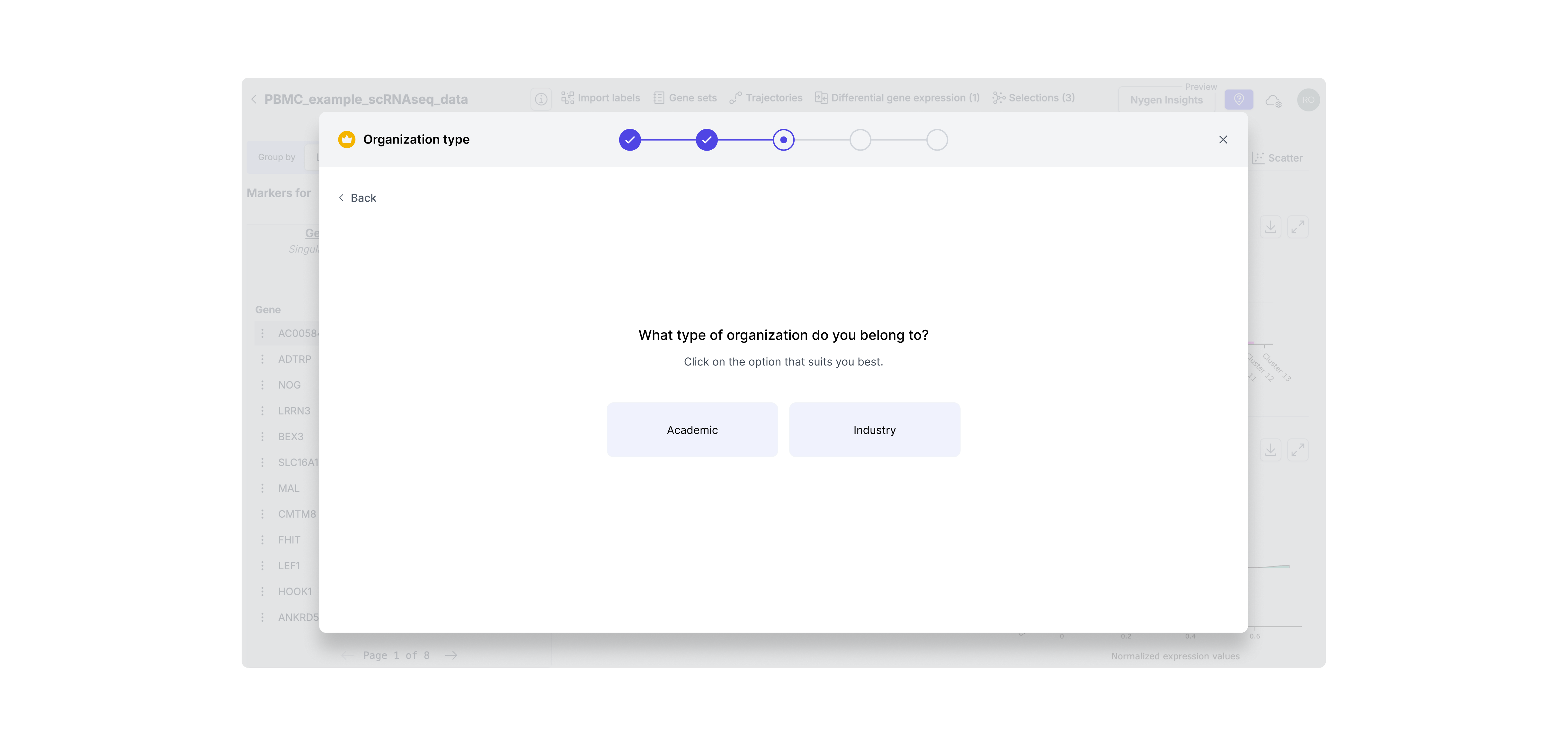
Step 3. Identify User Segment
Since academic and industry users have different pricing and needs, I added a segment step to tailor the flow. This enabled us to show the right message and pricing logic for each user type without confusion or wasted steps.
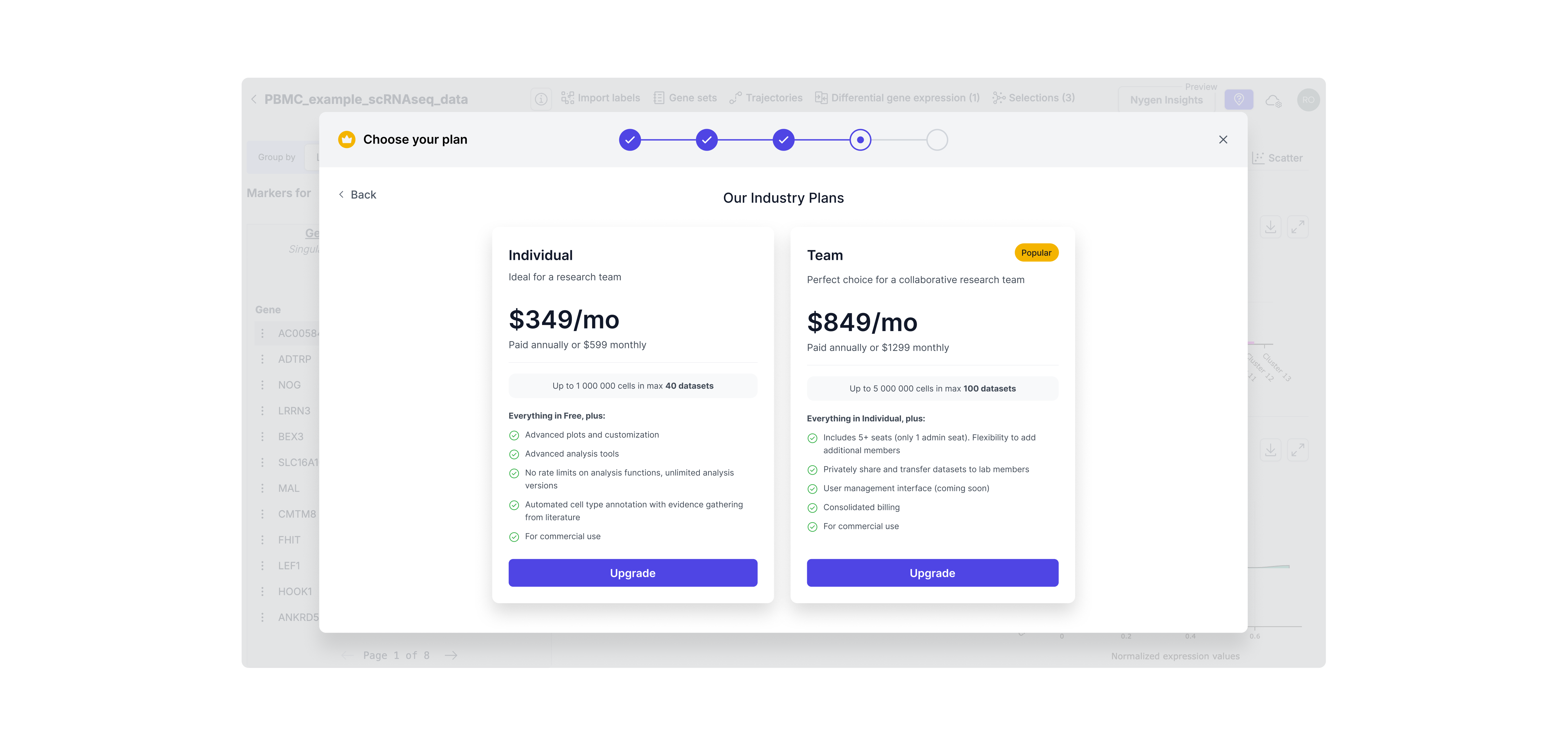
Step 4. Dynamic Plan Selection
Users now see only the plans relevant to their context (e.g., industry vs academic), reducing cognitive load and streamlining decision-making. This also set expectations around pricing earlier in the process, minimizing drop-offs.
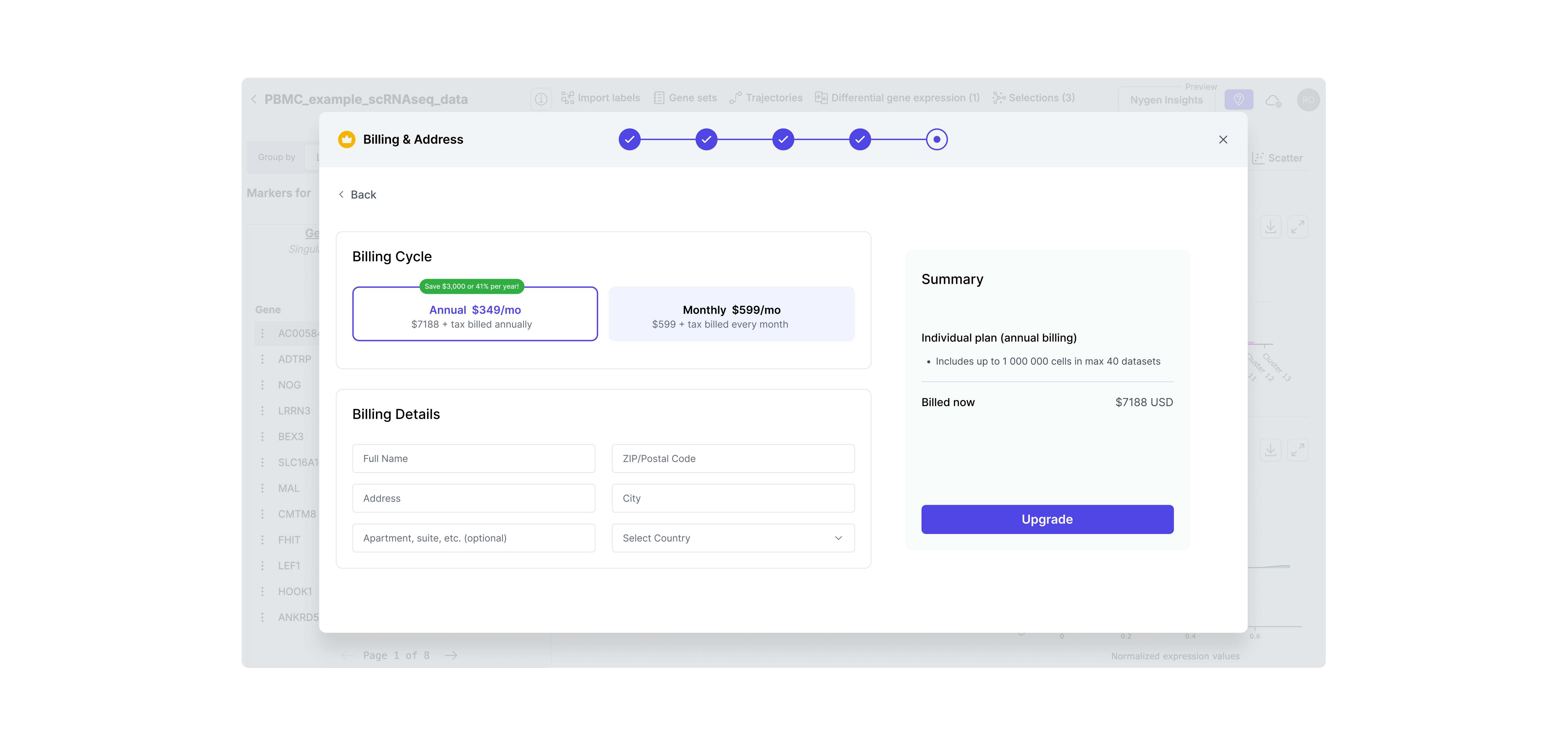
Step 5. Payment Step
To complete the self-serve flow, I designed a native payment screen with minimal friction. This eliminated the need for manual invoicing and let users convert instantly — aligning with our product-led growth goals.
Step 6. Premium feature unlocked
After upgrading, users are seamlessly returned to the tool with full access to previously gated features — in this case, advanced plot customization. This reinforces the value of upgrading immediately by removing blockers and showing the payoff without breaking flow.
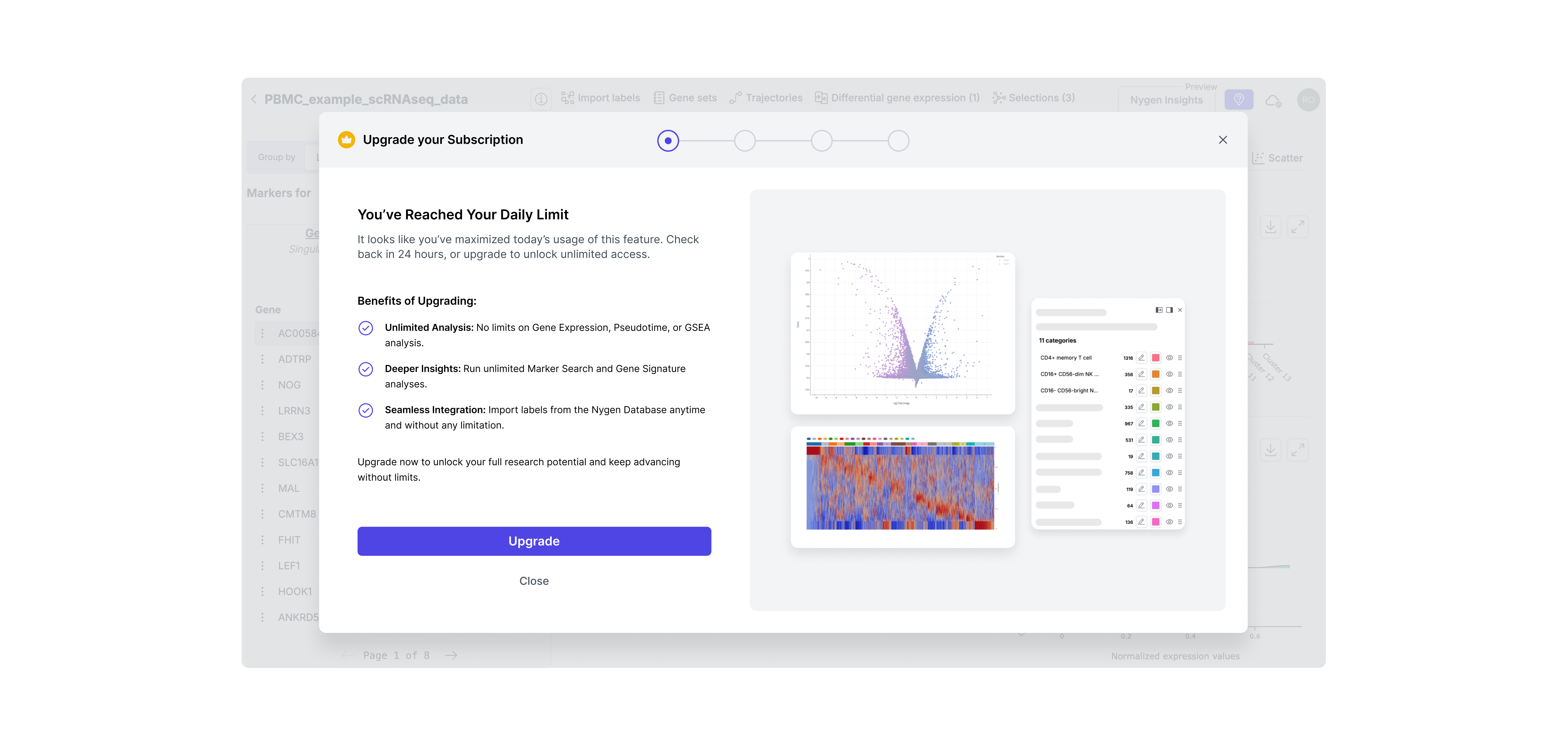
Free users often hit usage ceilings without realizing it — or were never nudged to upgrade at all. I introduced stronger, more transparent gating, including daily usage limits and quota-based gating. These patterns helped clearly communicate upgrade thresholds without disrupting trust or flow.
Hard limit gating
This type offeature gating was introduced for high-demand features like daily analysis. These were often used repeatedly by power users, so capping daily access helped surface the value of upgrading at exactly the right moment — when momentum was high. It created a clear, respectful boundary without breaking trust.
Quota-based gating
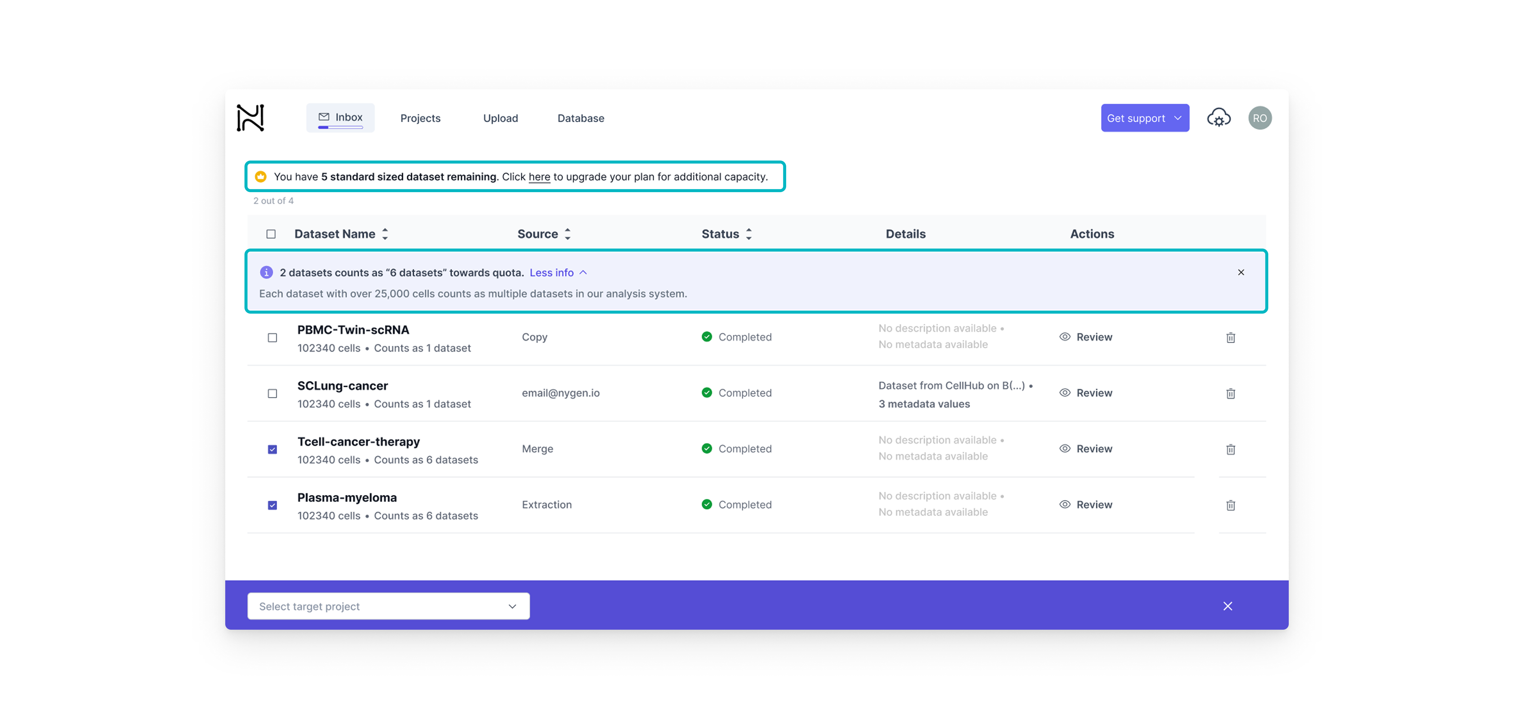
This type of feature gating on the other hand, was better suited for dataset-heavy workflows. Here, we wanted to build upgrade intent gradually. By showing how each dataset contributed to the user’s quota, we helped users understand their limits before hitting them — offering just-in-time nudges rather than abrupt stops.
I collaborated closely with the Front-End Developer and Head of Engineering through weekly design reviews and async updates via Teams and Notion. Clear Figma specs helped streamline handoff and minimize iteration loops.
I also maintained frequent syncs with the CEO to align on direction and incorporate strategic input. In parallel, I worked with the marketing specialist to fine-tune copy for each gated feature and ensure clarity at every upgrade prompt.
Since we lacked a formal design system, I created reusable UI components and tokens directly in Figma to ensure consistency. Most upgrades were released incrementally over 2 weeks to allow for quick fixes and internal feedback.
Designing for growth meant making smart calls under pressure. Each decision here wasn’t just about UI — it was about balancing user behavior, business goals, and technical constraints. Below you will find the key tradeoffs we made to drive adoption without breaking the user experience.
The tradeoff
• Hard paywall = stronger upgrade trigger but higher risk of user frustration.
• Soft paywall = low friction, but less urgency.
The tradeoff
• One-step modal = faster build
• Multi-step = clearer value, better analytics tracking
The tradeoff
• Fixed Plans simplify self-serve upgrades but can’t address enterprise needs.
• Custom Quotes provide flexibility but require sales and delay onboarding.
Each version of the upgrade modal taught us something. From weak CTAs to missing context, we quickly spotted what users ignored and why.This section highlights how we evolved the design through 3 fast iterations, improving clarity, credibility, and upgrade intent with each round.
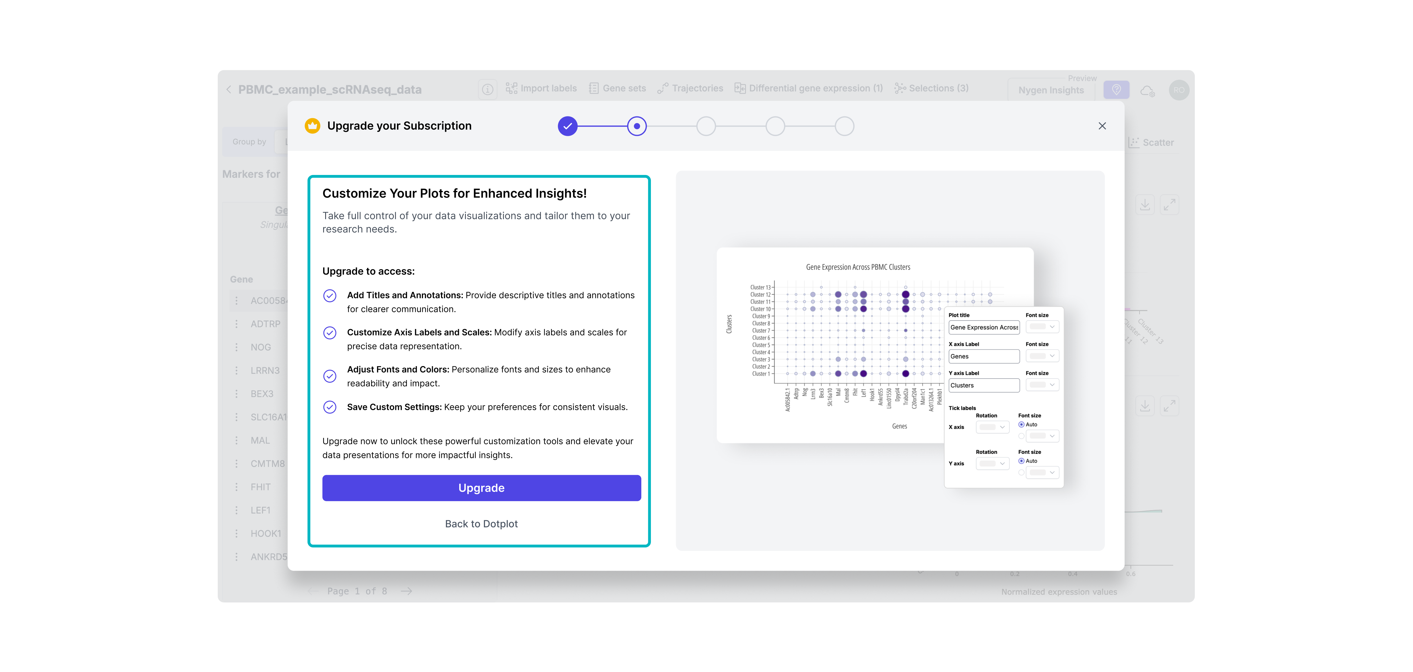
Iteration 1: Visual-Only Modal with Hidden CTA
Included a static image but no explanation of what features were gated. The upgrade button was small and secondary, and there was no way to return to the data (DotPlot) from the modal. -> Result: Users didn’t understand why they should upgrade — too subtle, no context, and easy to ignore.
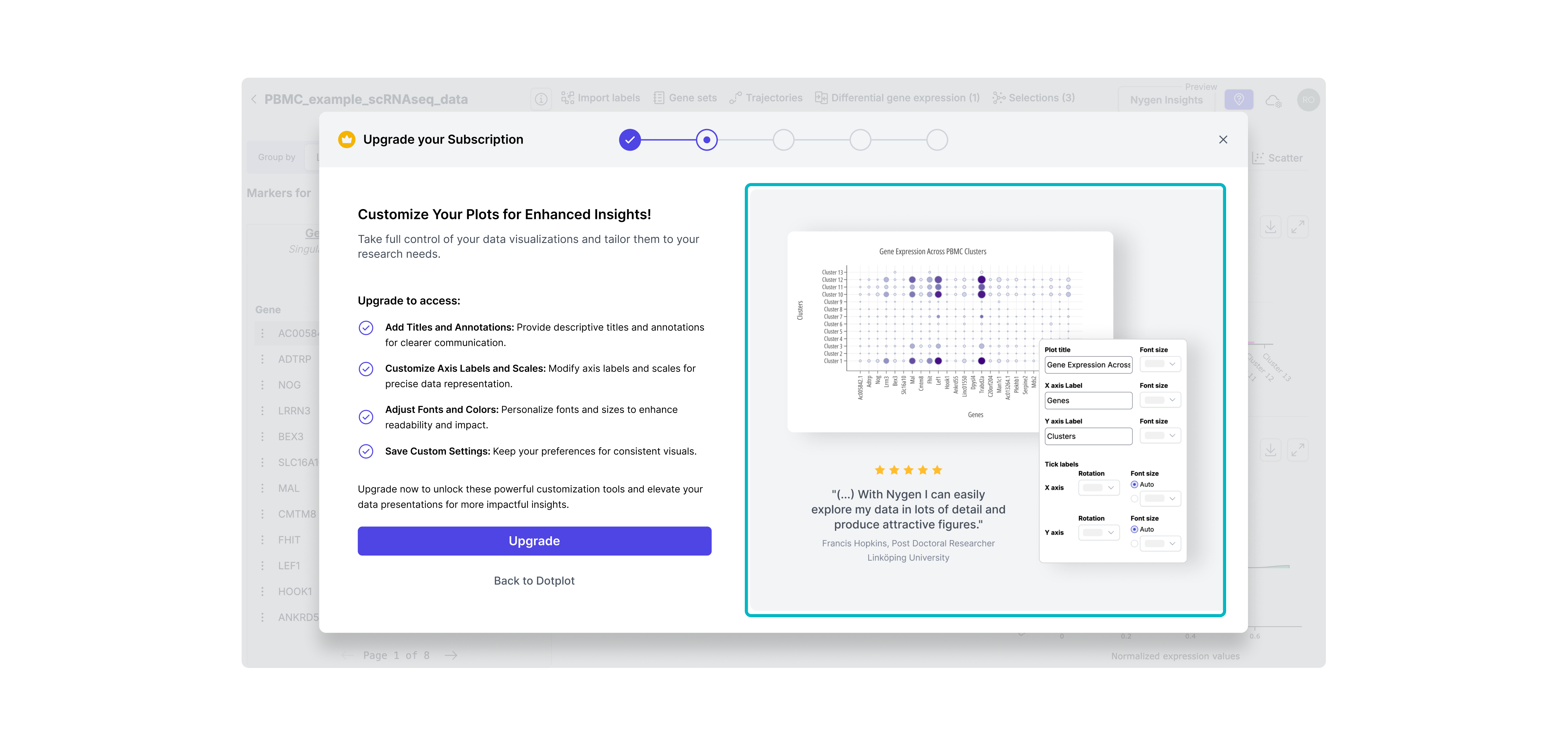
Iteration 2: Clear CTA + Basic Feature List
Made the CTA more prominent and added a brief bullet list of what upgrading unlocks. Still lacked context or emotional appeal. Result: Slightly improved clarity, but didn’t create enough motivation or urgency.
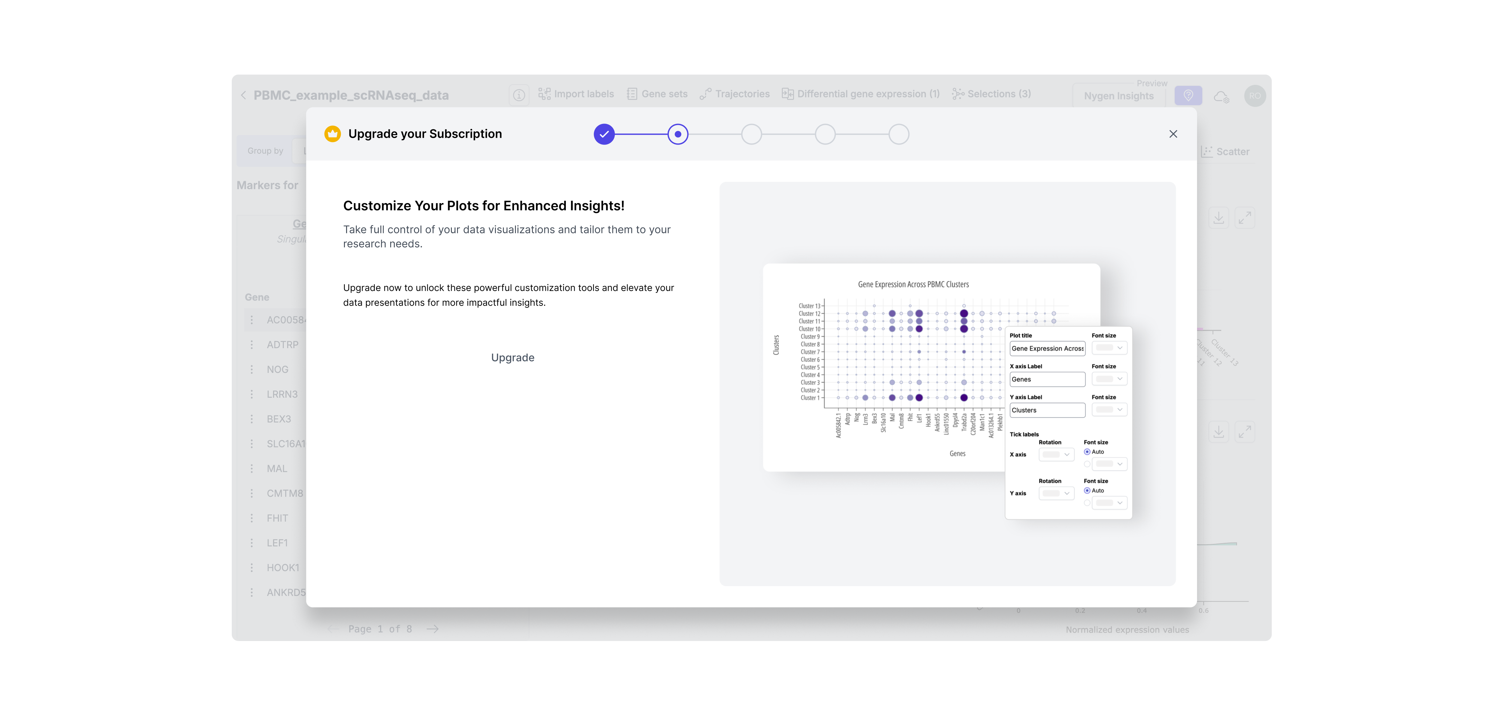
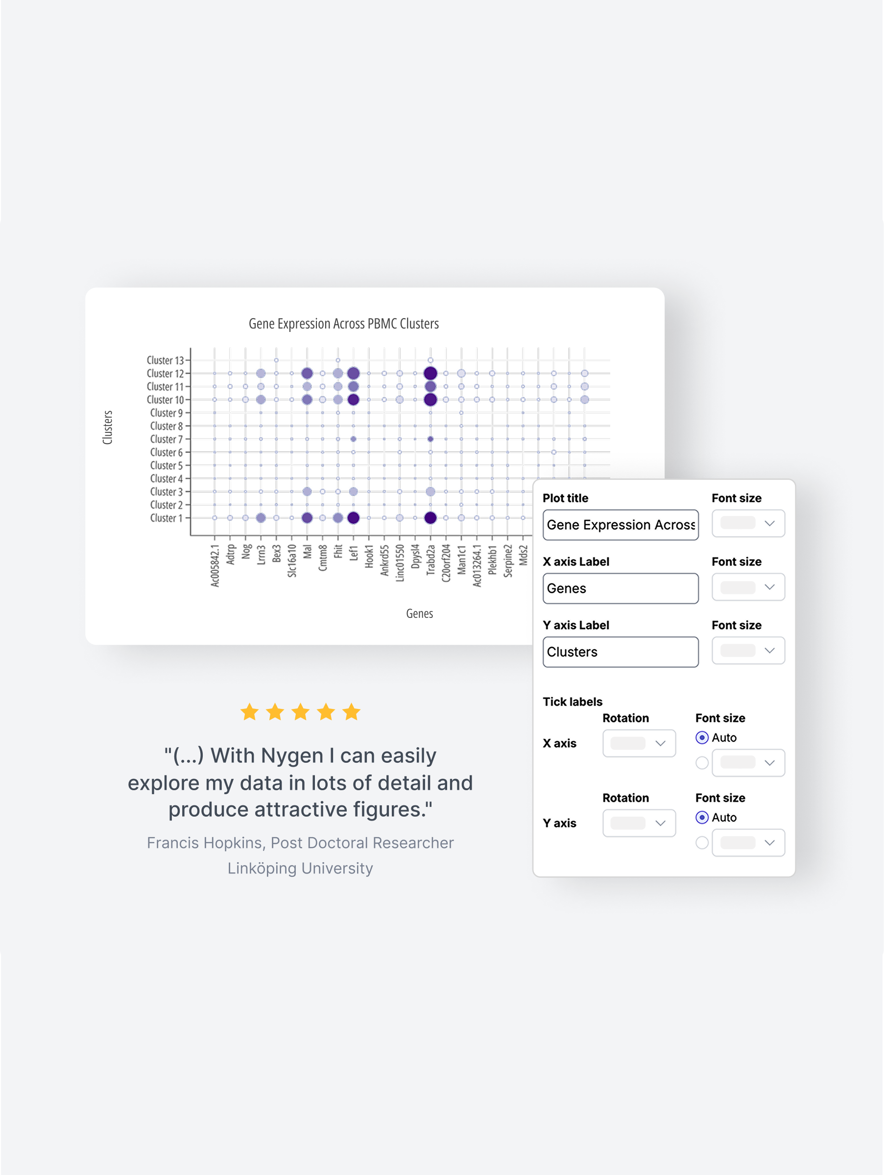
Iteration 3: Final Version - Visual Context & Value Framing
Combined clear CTA, detailed feature benefits, and a testimonial to boost credibility. Visuals matched the user’s context, reinforcing timing and value. -> Result: Felt more relevant and trustworthy, increasing upgrade intent at the right moment.
Clearer upgrade prompts and visible value signals helped more users recognize when to pay; right at the moment of need.
Users who signed up reached their “aha” faster: the guided upgrade path removed friction and improved onboarding experience.
By eliminating manual upgrade support, teams gained back time to focus on roadmap delivery and deeper work.
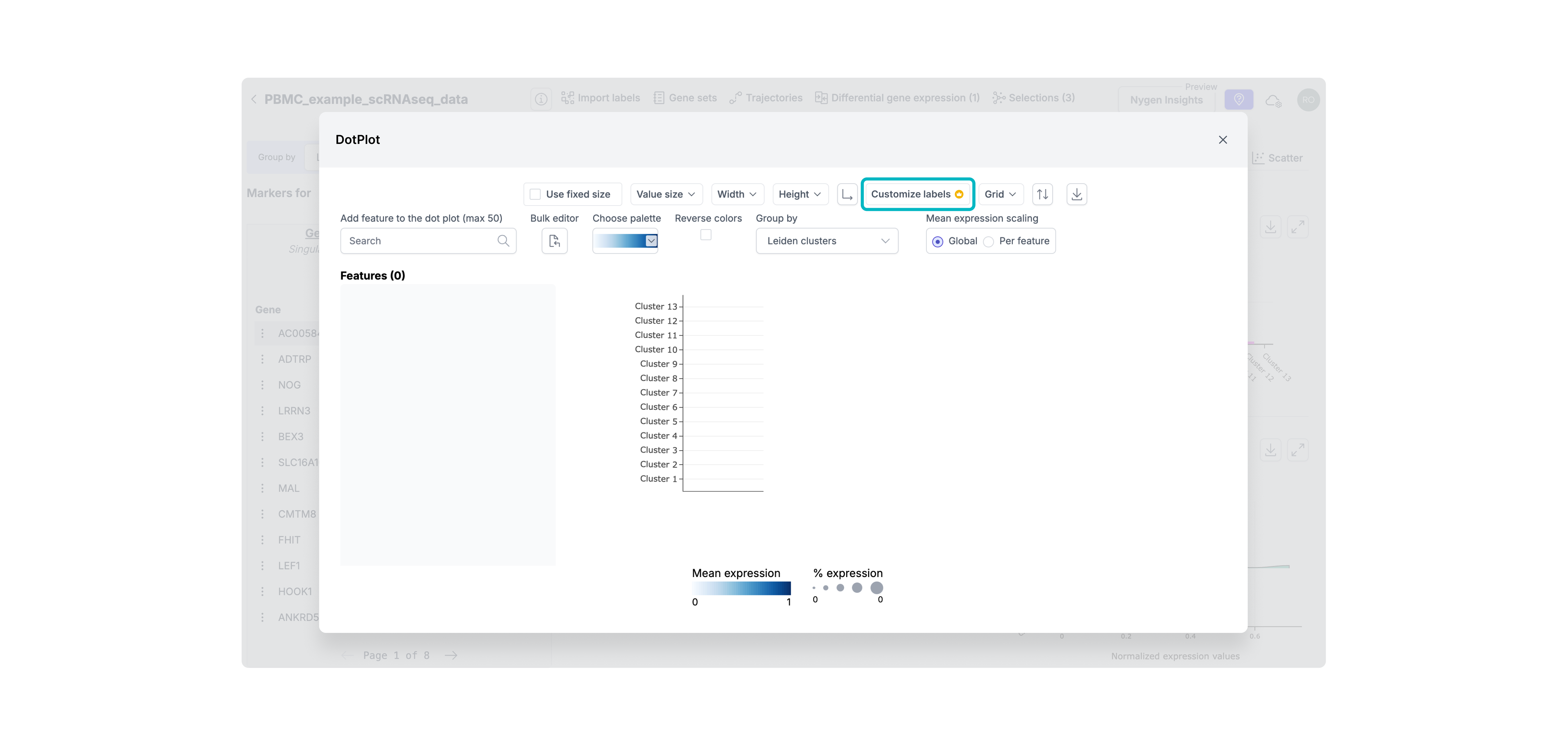
• Used event tracking (PostHog) to compare upgrade flow performance pre- and post-release.
• Tracked conversion and activation funnel changes week-over-week.
• Collected qualitative feedback from support and product teams on internal workload and user questions.
At the time, Nygen lacked in-app experimentation infrastructure. A/B testing wasn’t technically feasible, so we prioritized fast iteration backed by qualitative signals and behavioral data.

Although the contextual upgrade prompts were live, there was still room to evolve Nygen’s PLG strategy:
• Personalized upgrade triggers: Based on user roles, behavior patterns, or dataset types — to make prompts feel even more relevant.
• Usage-based trials: Offer limited-time access to a gated feature to spark upgrade intent.
• In-app onboarding improvements: Many users were unaware they were on a freemium plan — better onboarding could set expectations earlier.
• Deeper metrics instrumentation: With PostHog now in place, we could iterate faster with more confidence and track long-term impact.
This project reinforced several key lessons for me as a product designer:
💡 Don’t underestimate subtle friction: Users won’t upgrade if they don’t understand why, when, or how.
💡 Even soft paywalls need hard strategy: Modals should guide, not interrupt and must match user intent.
💡 Speed creates tradeoffs; clarity prevents waste: With limited time and data, crisp problem framing helped us prioritize and ship faster.
💡 Designing for growth is more than UI: It’s about timing, trust, and perceived value, not just pixels.
Interested in diving deeper? Take a look into my UX/UI accomplishments at Nygen Analytics.
How PLG & UX-Optimized Conversion Modals Increased Upgrades at Nygen
How a Multi-Page Website Boosted Nygen’s Traffic & User Engagement


.png)

.png)

.png)
.png)


.svg)