00
.
CASE STUDY
OVERVIEW
How I redesigned Nygen’s upgrade flow using product-led growth UX Tactics


What if your platform’s most valuable features were driving engagement — but not conversions?
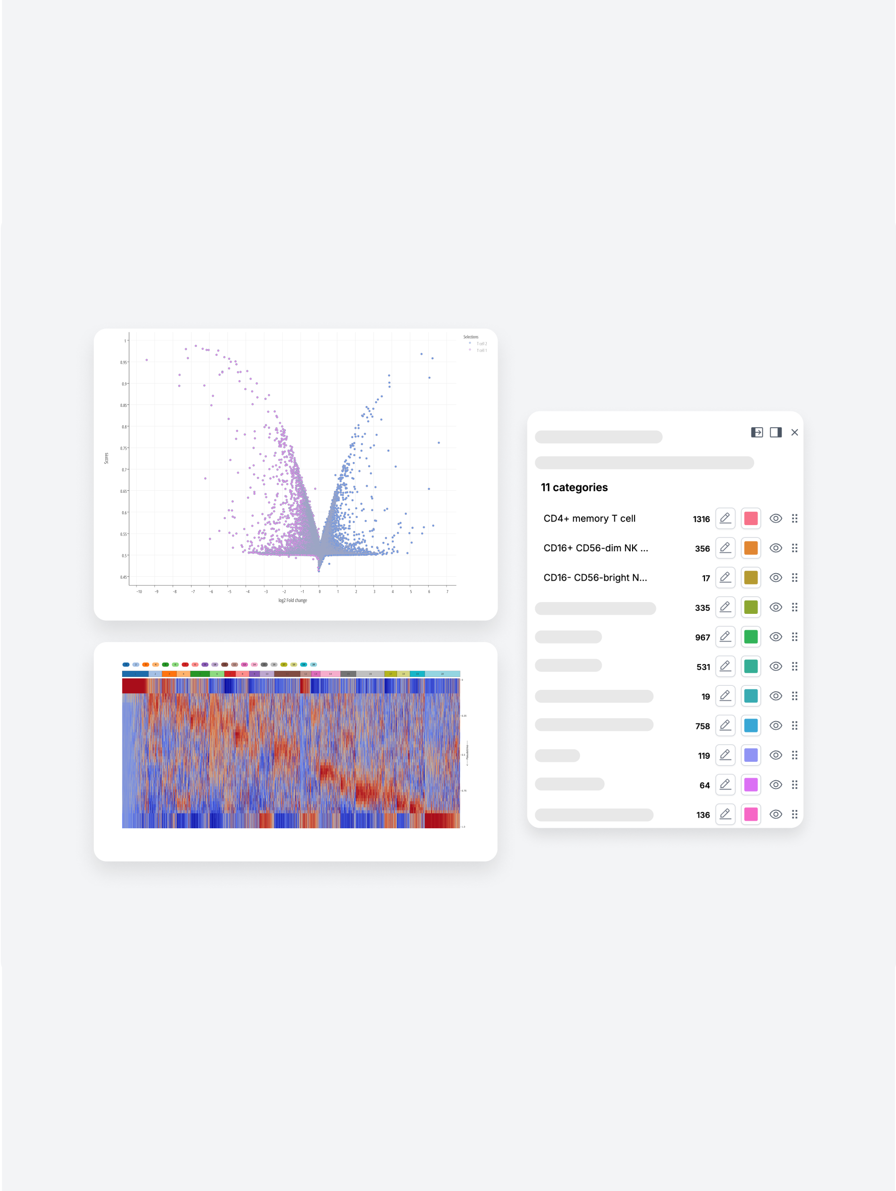
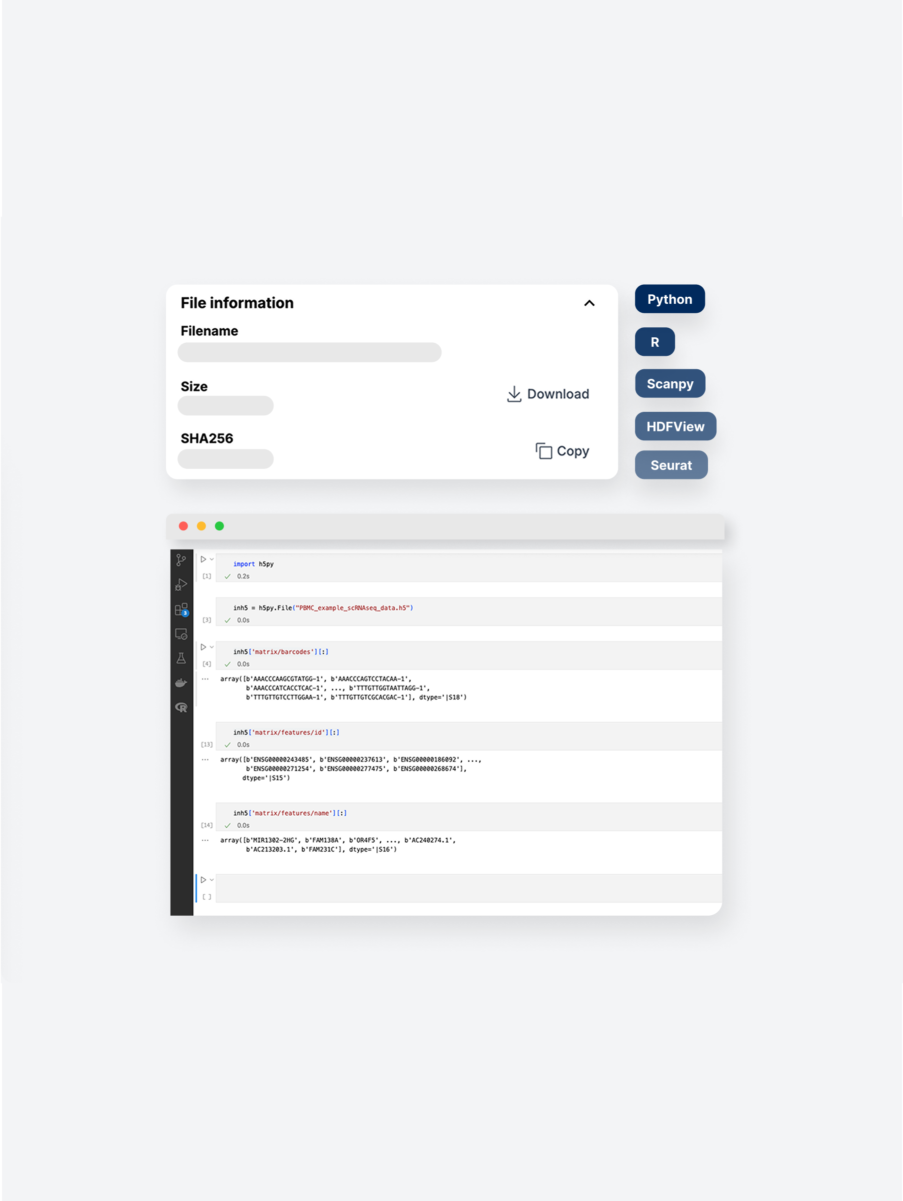
That was the case at Nygen Analytics, a data-heavy biotech SaaS platform that helps scientists explore and analyze single-cell RNA sequencing data — without writing code.
Despite strong engagement, too many users were flying under the radar: they regularly used premium features without realizing it and without upgrading.The freemium model was too generous. The upgrade path? Manual, buried, and easy to miss.
As the solo UX Lead, I partnered with product and engineering to rethink the entire upgrade experience: blending product-led growth (PLG) tactics with fast, data-informed UX. In just 3 months, this led to:
By adding contextual upgrade prompts at key premium features
Following the launch of a self-serve upgrade flow
By automating upgrades and reducing manual support
Disclaimer: This case study reflects my personal experience and perspective as UX Lead at Nygen. All impact metrics are approximations based on internal insights and do not represent official company-released data or views.

Nygen’s freemium model gave away too much value up front. Many users accessed premium features without realizing it — and stayed on free plans.
The result? Low conversion rates, user drop-off, and lost revenue opportunities.
The challenge:
How might we surface upgrade prompts at the right moments and design an experience that encourages conversion without disrupting user flow?

"We need to increase conversions by optimizing upgrade triggers, scale efficiently with a product-led approach (PLG), and expand across segments to reach both academic and industry users."
What that meant in practice:
Nygen’s leadership wanted to reduce sales bottlenecks and make growth more scalable.
The team had recently been tasked by the Board with testing a PLG approach.
PLG was a strategic lever to test self-serve viability and reduce sales strain.
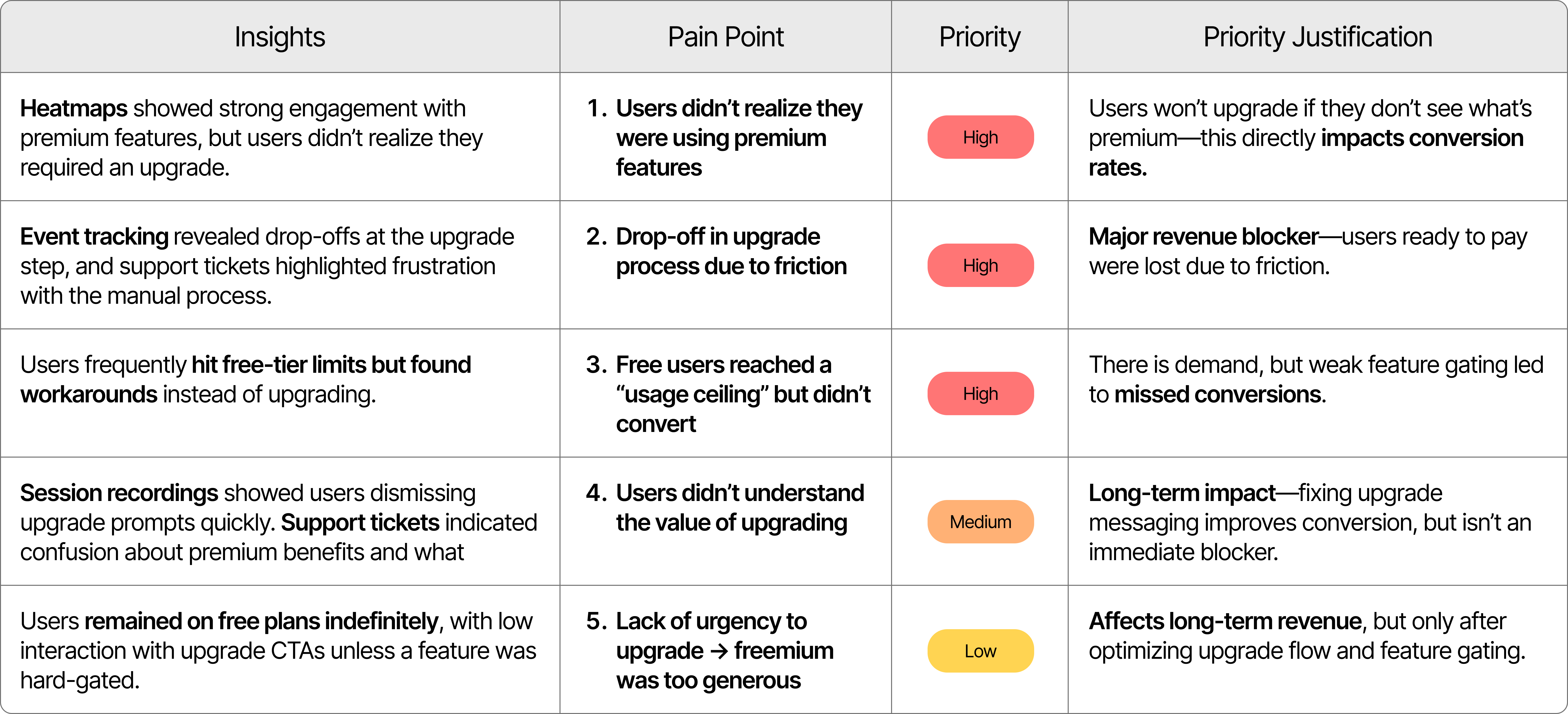
I investigated usage data, heatmaps, support tickets, and session recordings. What emerged were 3 root issues:
Users didn’t realize they were using premium features
-> No clear prompts or labels
-> Stayed on free plans unknowingly
Upgrading required manual steps and contacting support
-> No seamless in-app upgrade flow
-> Drop-offs at upgrade step
Free users accessed too many features without limits
-> No urgency to upgrade
-> Missed revenue opportunities
Nygen’s core audience included three clearly defined user groups that had been identified and categorized by the team:
• Role: Generate datasets through experiments
• Challenge: Rely heavily on bioinformaticians for analysis; budget limits upgrade decisions
• Motivation: Save time, gain autonomy, and access easy-to-use workflows
• Role: Analyze data and manage pipelines
• Challenge: Prefer open-source tools; hit bottlenecks with large datasets
• Motivation for upgrade: Seek faster processing, API access, and better export tools
• Role: Oversee grants, purchasing, and strategy
• Challenge: Need clear ROI to justify costs
• Motivation: Ensure compliance, enable collaboration, and prove impact
Many unknowingly accessed premium features and continued using them without upgrading. With no paywalls or prompts, users encountered no friction — so upgrade intent never surfaced.
The CEO and CPO (Head of Engineering) led the charge on growth and product-market fit. They were directly invested in increasing conversion rates and validating Product-Led Growth success ahead of the next funding round. Product and engineering leads supported execution.
As the sole UX designer at Nygen, I owned the end-to-end UX strategy and execution for this growth-critical initiative. I worked closely with product, engineering, and the founding team in a fast-paced startup environment.
I worked in a lean, cross-functional team of 6:
• Parashar Dhapola, CEO & Co-founder
• Oskar Börjesson, Head of Engineering & Co-founder
• Elena Myadzeleva, Front-end Developer
• Yi Su, Bioinformatician
• Sukhitha Basnayake, Marketing Specialist
• Prof. Göran Karlsson, Head of Partnerships

I worked on the following tasks:
• Defined the UX strategy for gated feature upgrades
• Conducted user research and support feedback analysis
• Prototyped paywalls and redesigned upgrade flow
• Delivered dev-ready Figma specs and QA
• Worked with stakeholders to align UX with growth goals
• Partnered with marketing to refine in-app messaging
.png)
We had a 3-month window to test product-led growth initiatives ahead of the next funding round — all while I juggled multiple parallel projects like new website pages and marketing assets. Speed and focus were critical.

Due to limited time and resources, we couldn’t run formal usability tests. Instead, we relied on product analytics, support tickets, and internal bioinformatics input to guide decisions.

With no A/B testing infrastructure in place, decisions were made using post-launch behavioral data and team alignment.
While we aimed for self-serve PLG, some plans still required manual sales involvement, creating flow complexity that needed to be reflected in the UX.
I chose a multi-method approach to triangulate data and reduce bias, working within a 2-week research window due to aggressive product roadmap constraints. PostHog provided quantitative behavioral data at scale, while session recordings revealed the "why" behind user actions, and support tickets validated pain points from a user frustration perspective.
Key Constraints: Limited to existing data sources (no budget/time for user interviews), small team and legacy billing system limitations that influenced solution feasibility.

Design Focus Area #1
Many users didn’t realize they were using premium features.
→ Design upgrade prompts that clearly highlight premium benefits at the moment of need.
Design Focus Area #2
The manual, sales-dependent process slowed users down.
-> Build a seamless in-app upgrade flow that eliminates delays and removes sales dependencies.
Design Focus Area #3
Free users stayed indefinitely because limits weren’t clear or enforced.
-> Design hard and quota-based gates that communicate limits, reinforce value, and nudge upgrades at the right time.
.png)

❌ Users didn’t realize which features were premium.
❌ Upgrade flows felt too manual and high-friction.
❌ Gating was inconsistent or missing altogether.

#01. Clarify Premium Value: contextual nudges & visual cues.
#02. Reduce Upgrade Friction: a guided in-app flow
#03. Strengthen Feature Gating: soft walls, quotas & daily limits

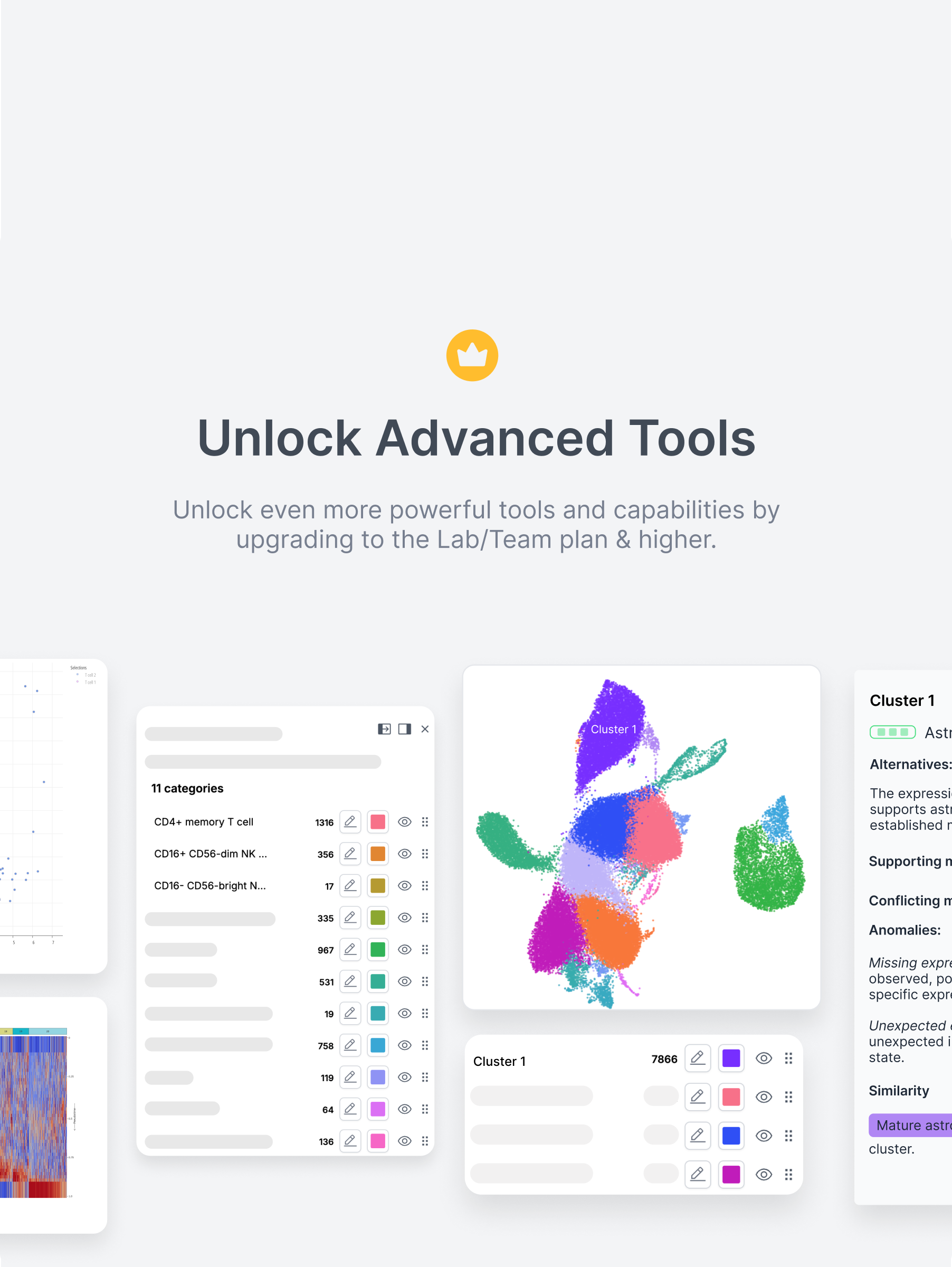
Many users didn’t even realize they were using premium features. To address this, I introduced soft paywalls, in-context upgrade nudges, and visual cues that helped users recognize value at the exact moment of interaction — without interrupting their flow or creating frustration.

Before
Free users could access advanced insights like cluster alternatives and supporting markers — without realizing these were premium features. This lack of visibility made upgrades unlikely, since users didn’t understand what value they were getting for free — or what they’d gain by paying.

After
A soft paywall now highlights premium content with subtle overlays and upgrade prompts. This approach clearly signals value without blocking access, helping users understand what’s included in their plan and nudging them toward upgrading at the right moment.
Previously, upgrading required users to email support, wait days, and manually submit payment details — a process full of drop-off points. I replaced this with a guided, in-app upgrade flow that let users select a plan, input payment, and gain access instantly — all without leaving the product.
Step 1. Highlighting Premium Features
To help users recognize premium functionality before hitting a hard wall, I added soft visual indicators (like the crown icon) on premium actions. This created early awareness of value and primed users for the upgrade flow without interrupting their workflow.
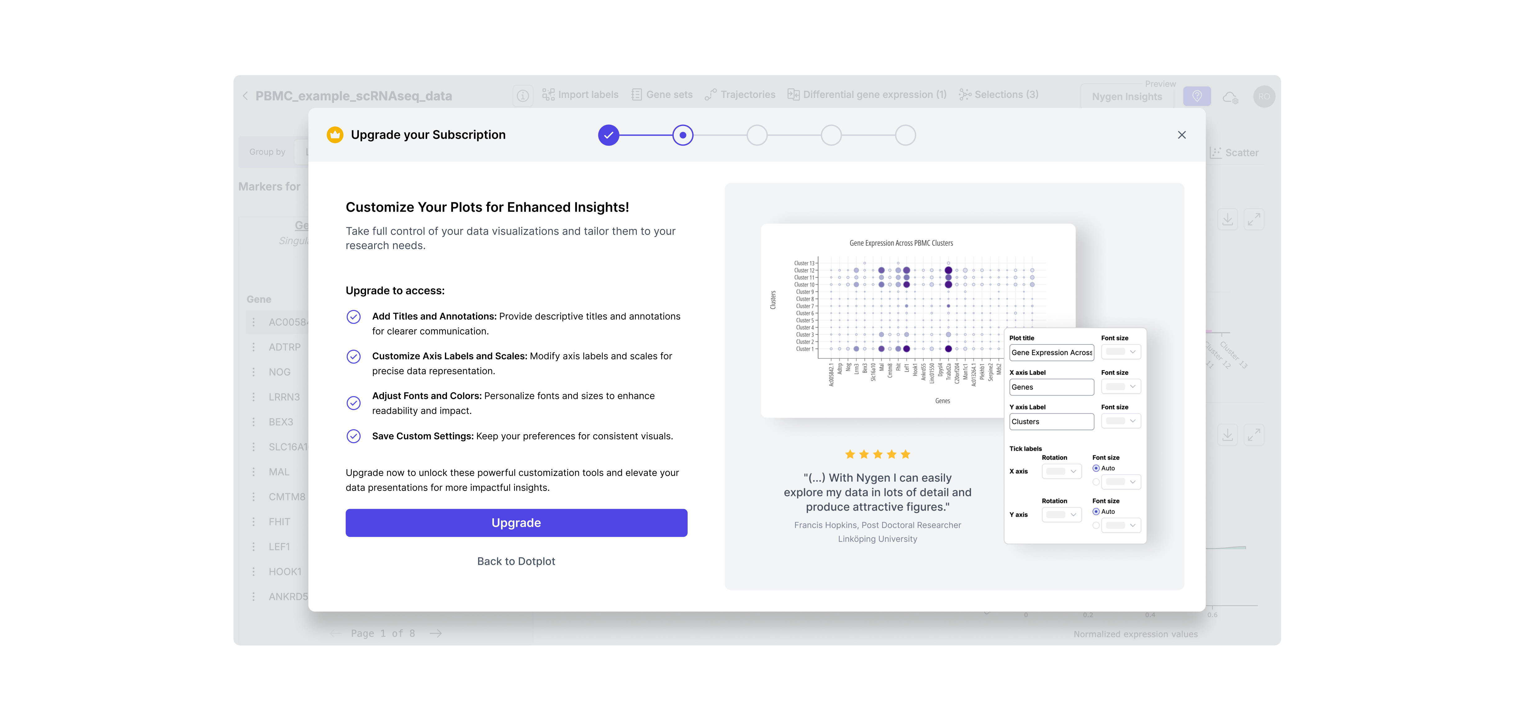
Step 2. Contextual Upgrade Modal
Instead of generic upgrade CTAs, I designed contextual modals triggered at the moment of intent. This ensured the upgrade pitch was relevant, well-timed, and directly tied to the feature the user just tried to access.
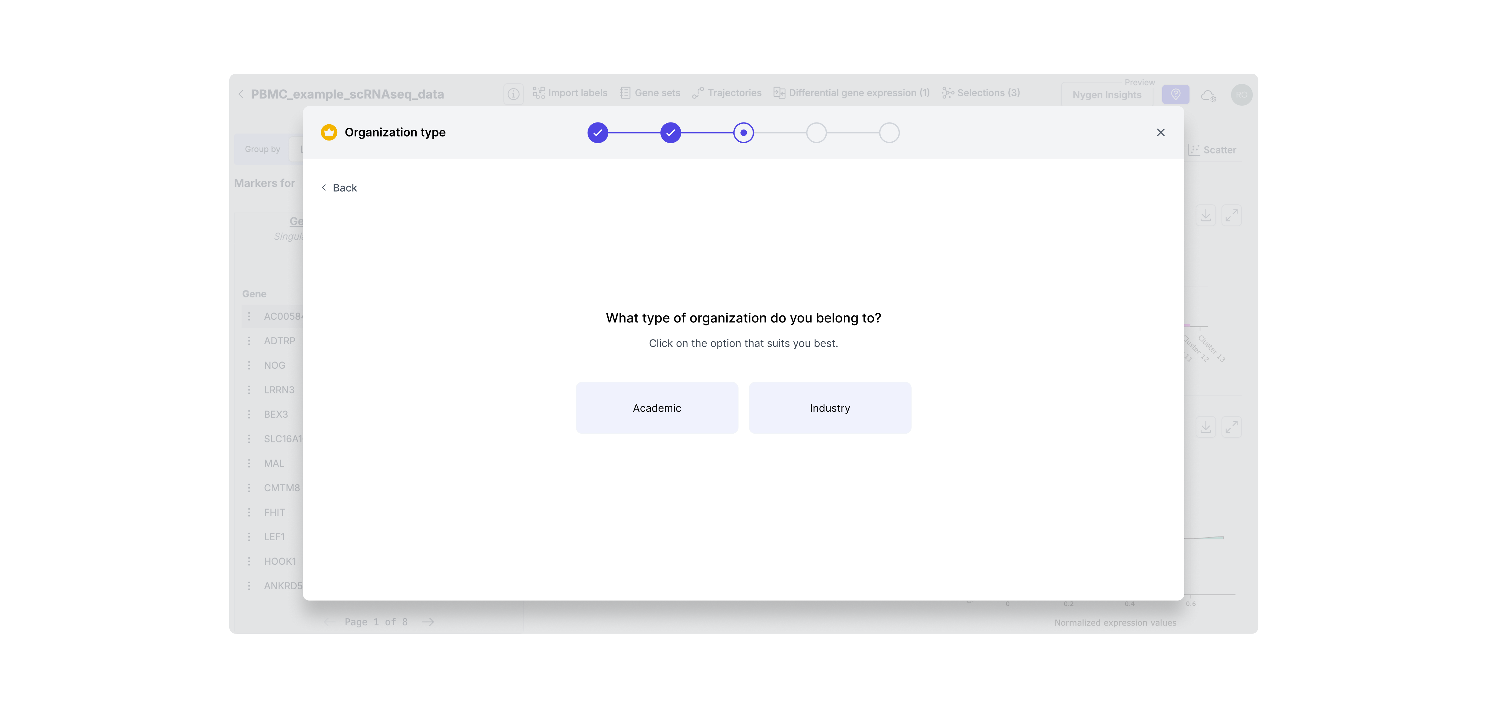
Step 3. Identify User Segment
Since academic and industry users have different pricing and needs, I added a segment step to tailor the flow. This enabled us to show the right message and pricing logic for each user type without confusion or wasted steps.
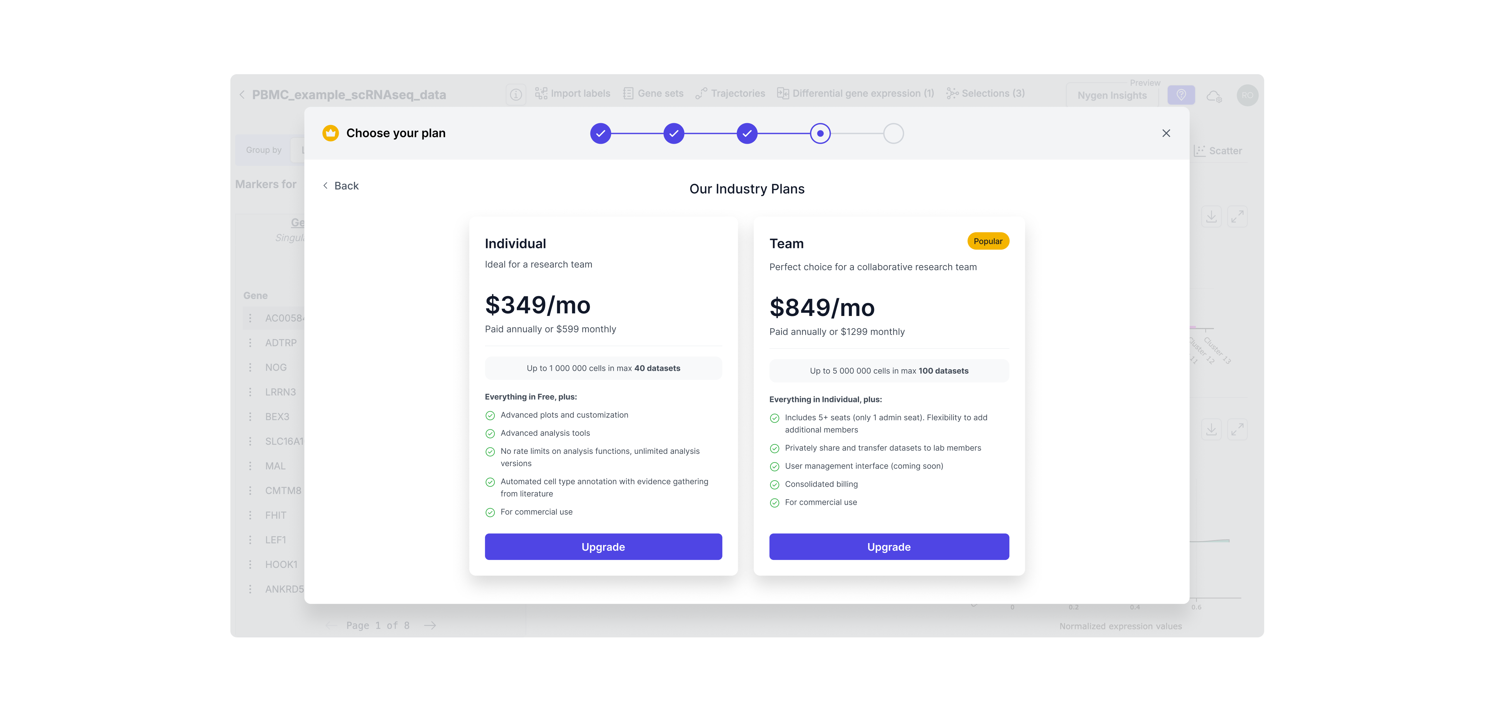
Step 4. Dynamic Plan Selection
Users now see only the plans relevant to their context (e.g., industry vs academic), reducing cognitive load and streamlining decision-making. This also set expectations around pricing earlier in the process, minimizing drop-offs.
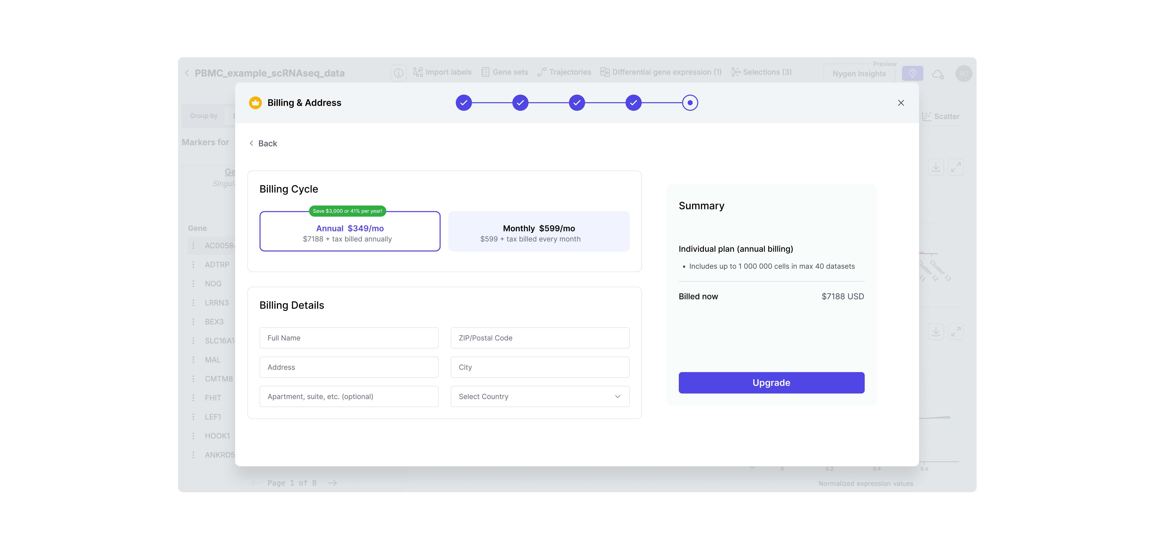
Step 5. Payment Step
To complete the self-serve flow, I designed a native payment screen with minimal friction. This eliminated the need for manual invoicing and let users convert instantly — aligning with our product-led growth goals.
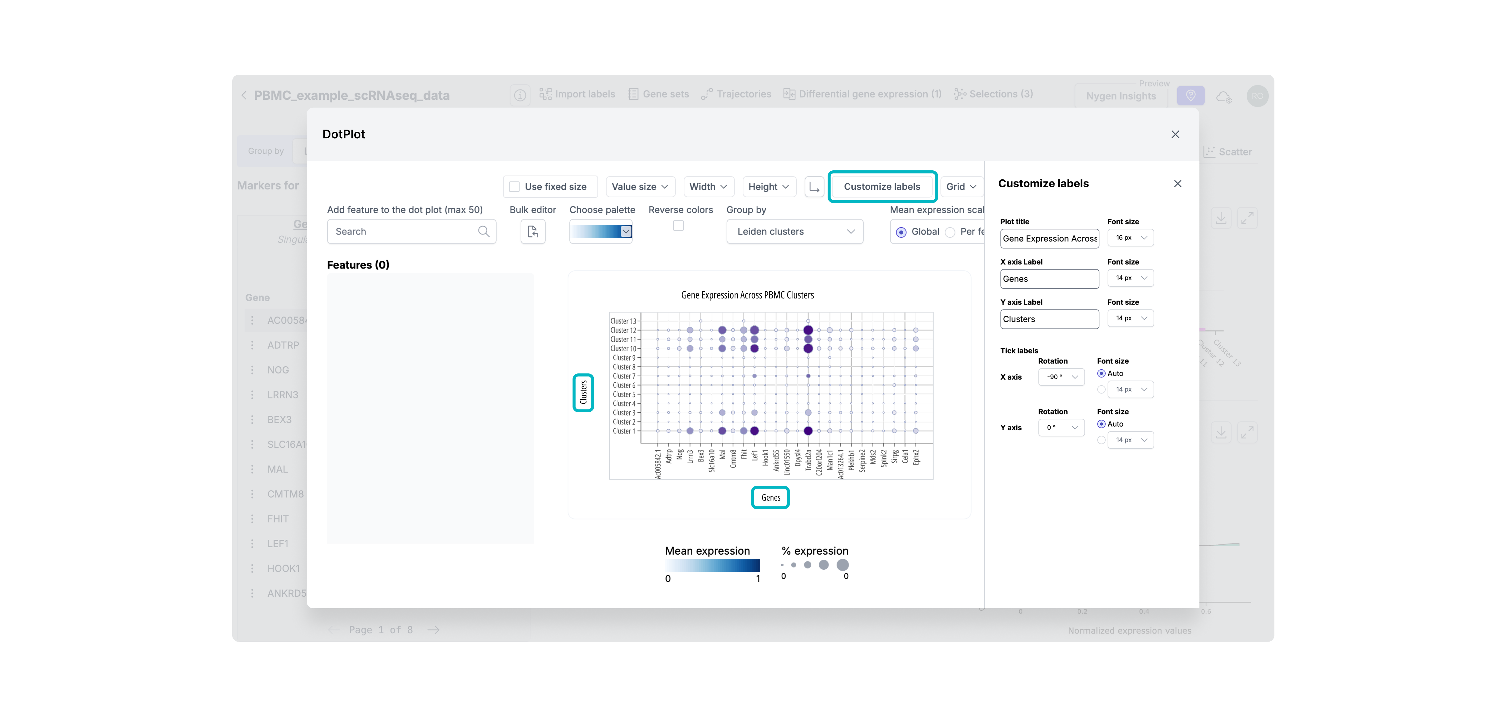
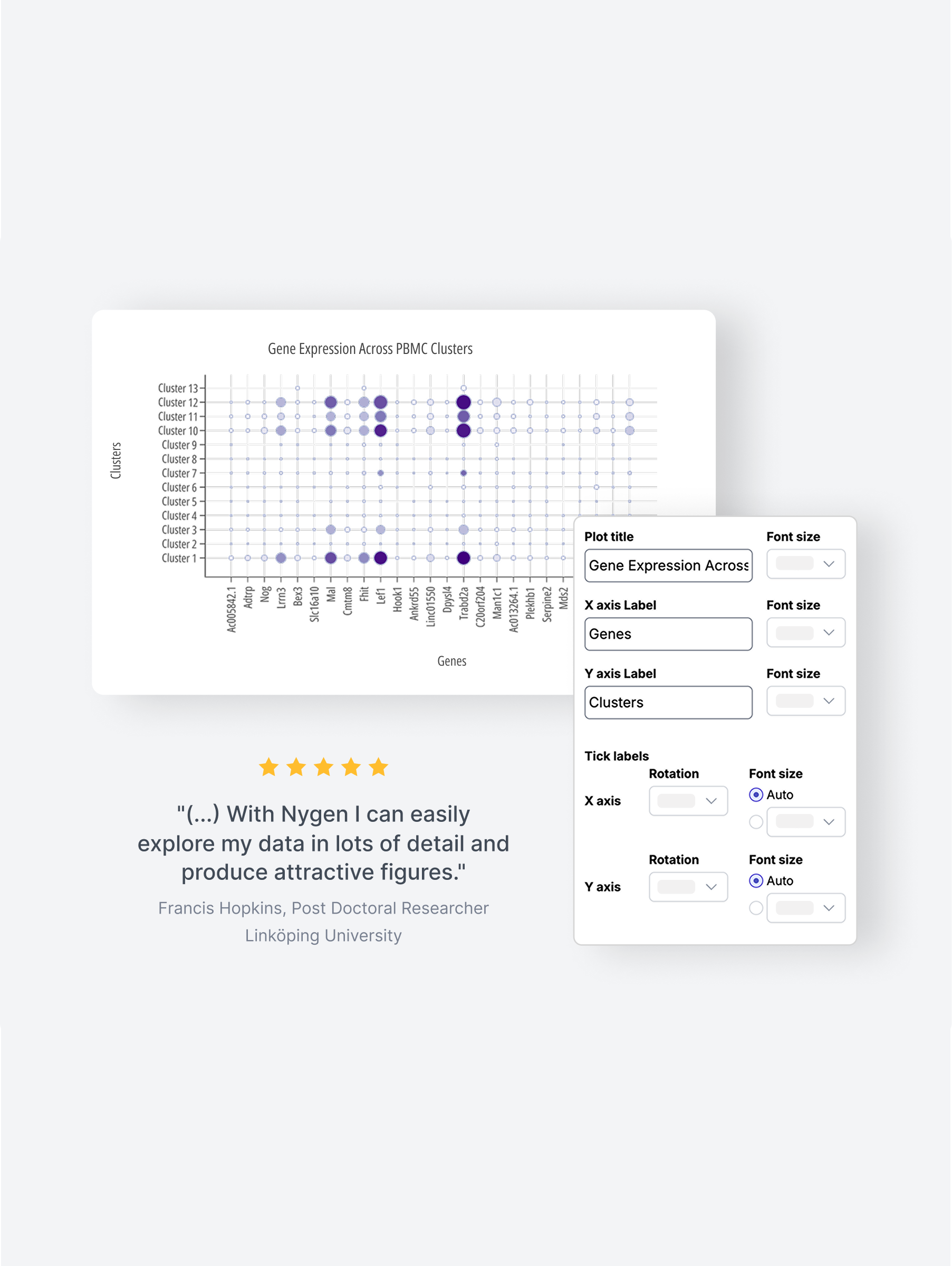
Step 6. Premium feature unlocked
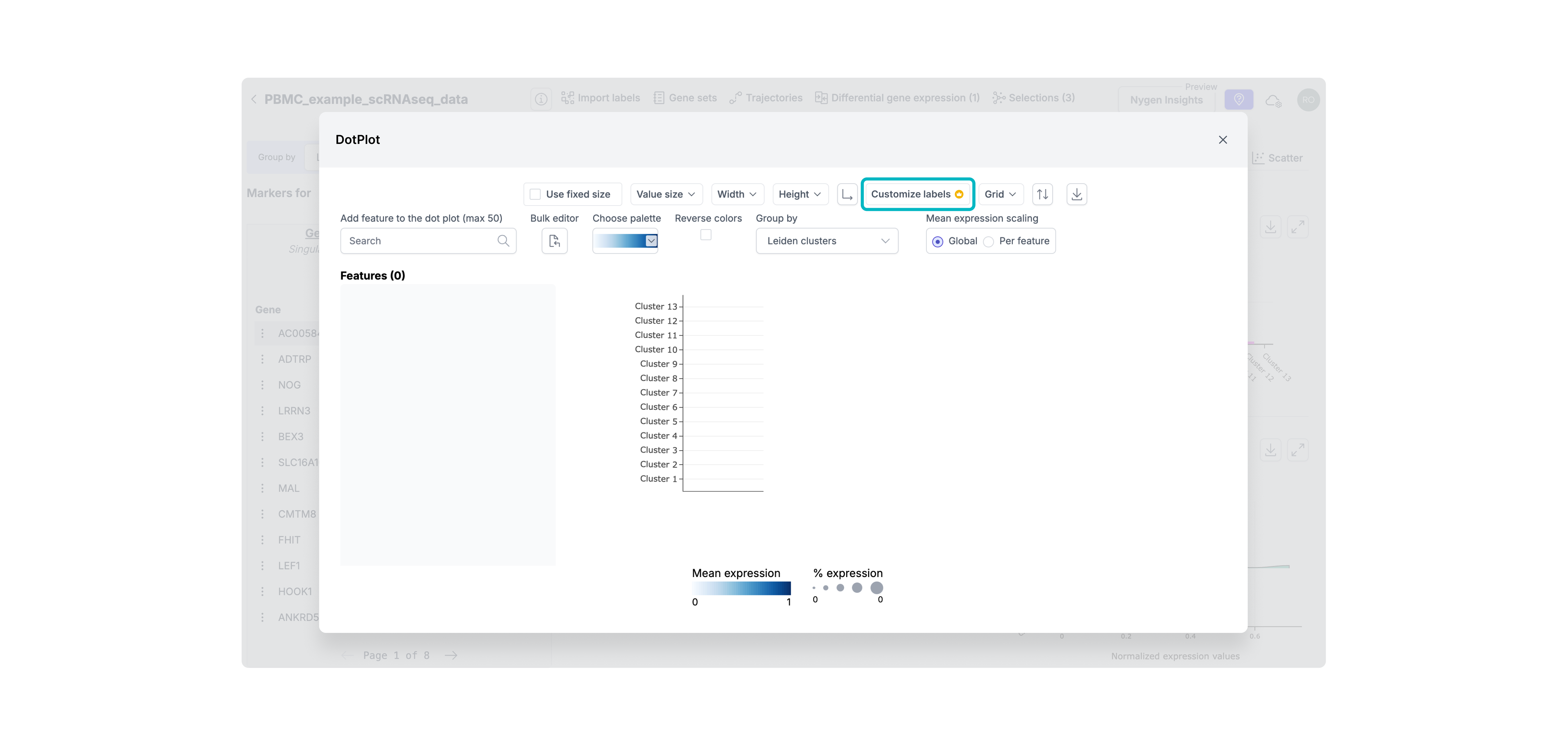
After upgrading, users are seamlessly returned to the tool with full access to previously gated features — in this case, advanced plot customization. This reinforces the value of upgrading immediately by removing blockers and showing the payoff without breaking flow.
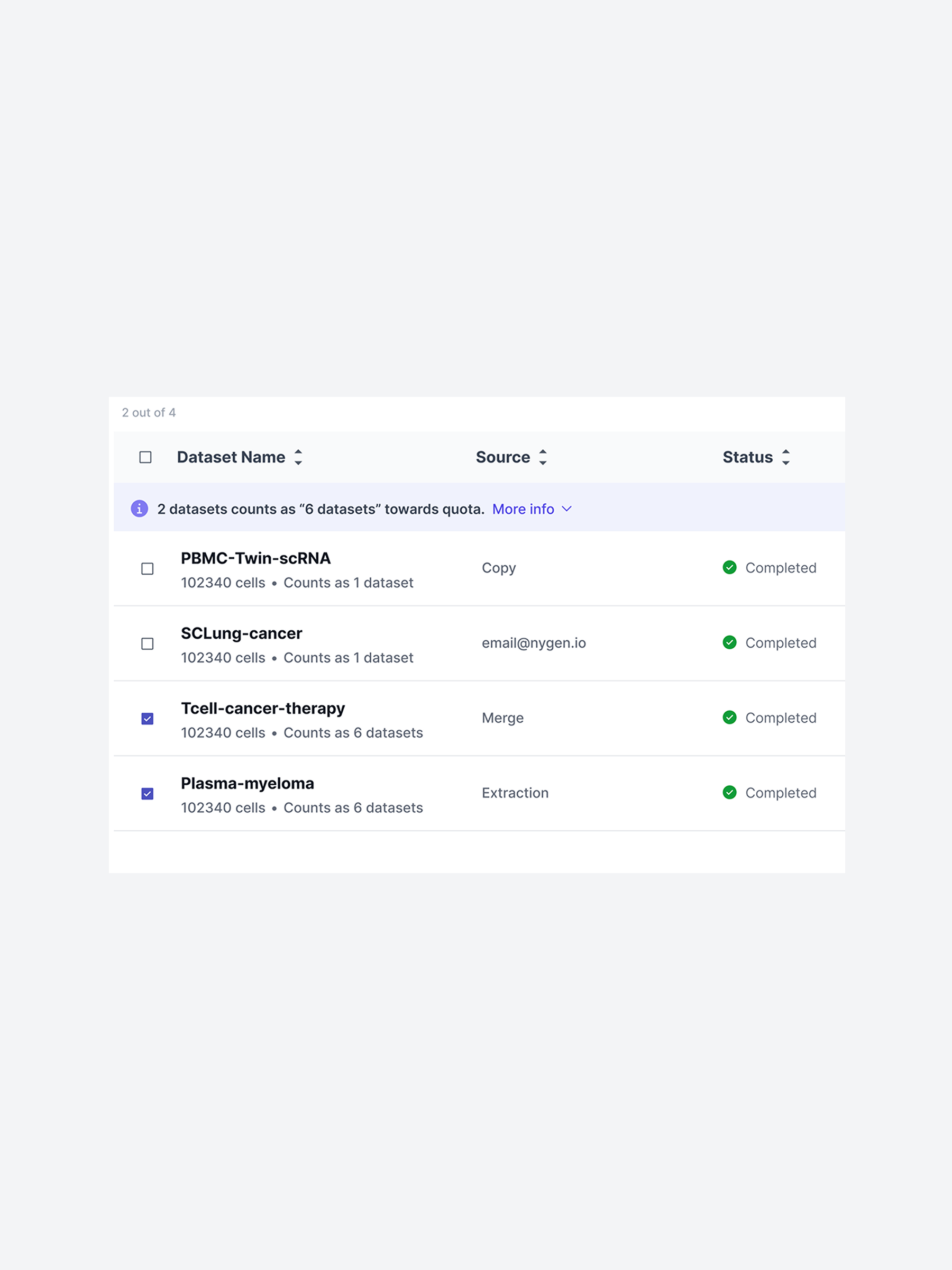
Free users often hit usage ceilings without realizing it — or were never nudged to upgrade at all. I introduced stronger, more transparent gating, including daily usage limits and quota-based gating. These patterns helped clearly communicate upgrade thresholds without disrupting trust or flow.
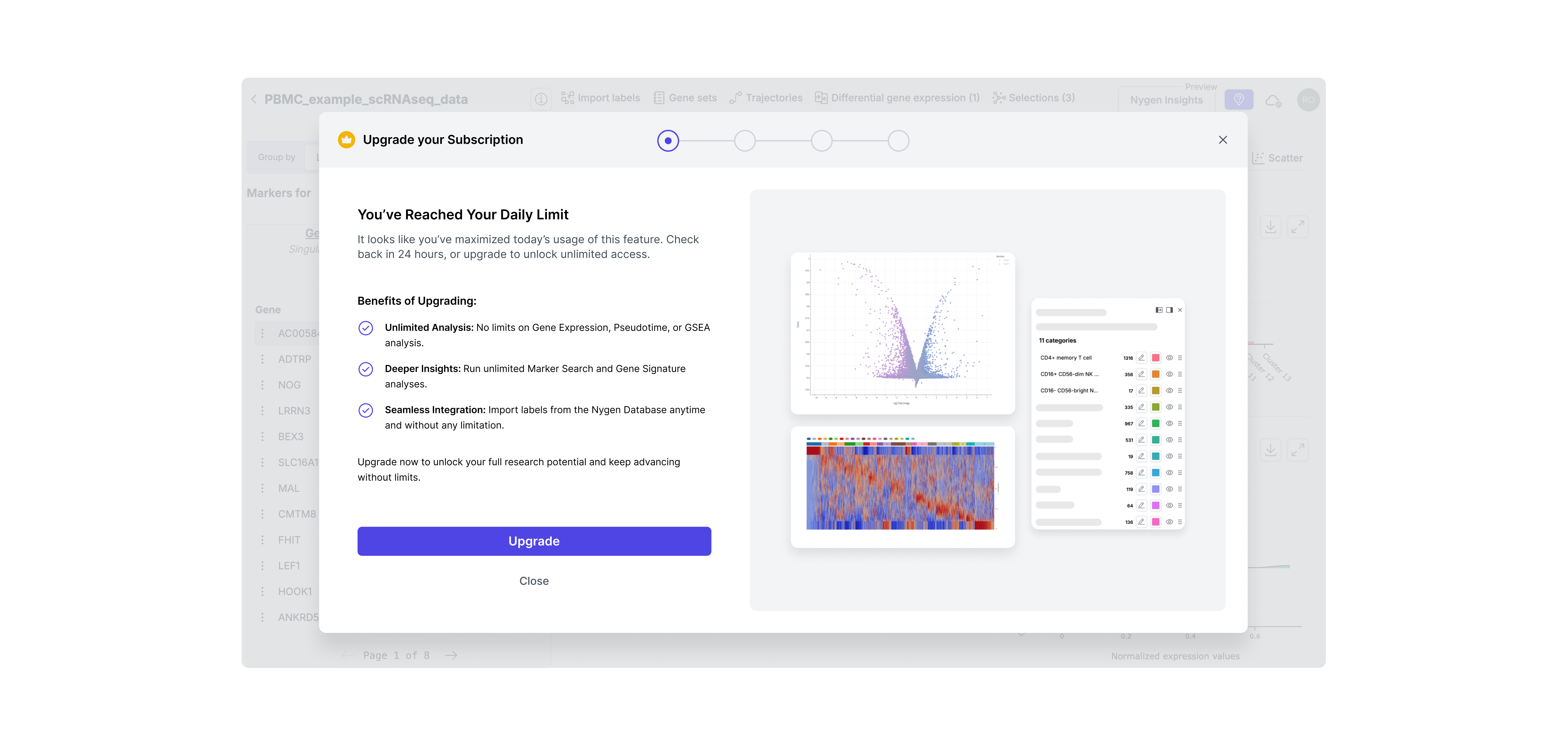
Hard limit gating
This type offeature gating was introduced for high-demand features like daily analysis. These were often used repeatedly by power users, so capping daily access helped surface the value of upgrading at exactly the right moment — when momentum was high. It created a clear, respectful boundary without breaking trust.
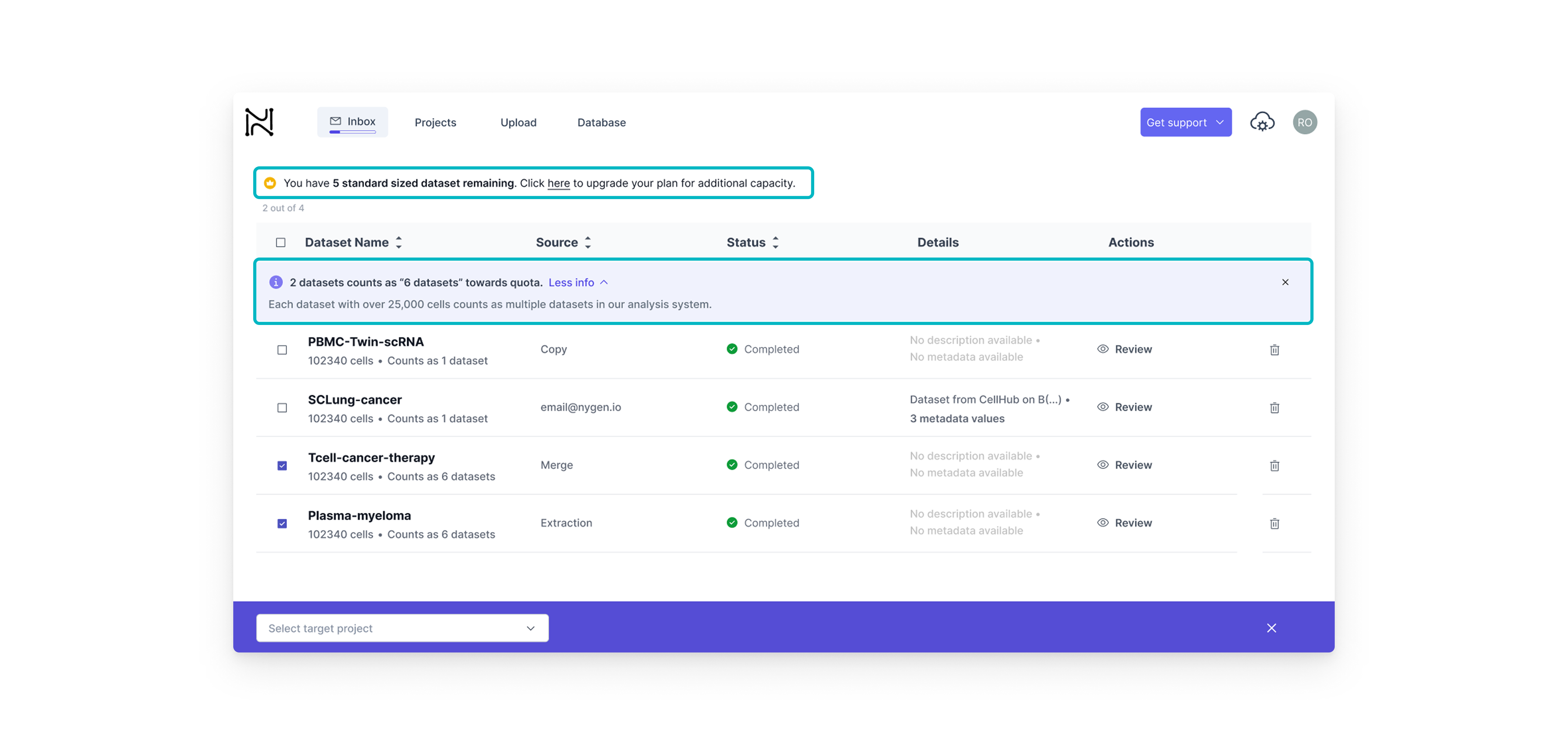
Quota-based gating
This type of feature gating on the other hand, was better suited for dataset-heavy workflows. Here, we wanted to build upgrade intent gradually. By showing how each dataset contributed to the user’s quota, we helped users understand their limits before hitting them — offering just-in-time nudges rather than abrupt stops.
I collaborated closely with the Front-End Developer and Head of Engineering through weekly design reviews and async updates via Teams and Notion. Clear Figma specs helped streamline handoff and minimize iteration loops.
I also maintained frequent syncs with the CEO to align on direction and incorporate strategic input. In parallel, I worked with the marketing specialist to fine-tune copy for each gated feature and ensure clarity at every upgrade prompt.
Since we lacked a formal design system, I created reusable UI components and tokens directly in Figma to ensure consistency. Most upgrades were released incrementally over 2 weeks to allow for quick fixes and internal feedback.
Designing for growth meant making smart calls under pressure. Each decision here wasn’t just about UI — it was about balancing user behavior, business goals, and technical constraints. Below you will find the key tradeoffs we made to drive adoption without breaking the user experience.
The tradeoff
• Hard paywall = stronger upgrade trigger but higher risk of user frustration.
• Soft paywall = low friction, but less urgency.
The tradeoff
• One-step modal = faster build
• Multi-step = clearer value, better analytics tracking
The tradeoff
• Fixed Plans simplify self-serve upgrades but can’t address enterprise needs.
• Custom Quotes provide flexibility but require sales and delay onboarding.
Each version of the upgrade modal taught us something. From weak CTAs to missing context, we quickly spotted what users ignored and why.This section highlights how we evolved the design through 3 fast iterations, improving clarity, credibility, and upgrade intent with each round.
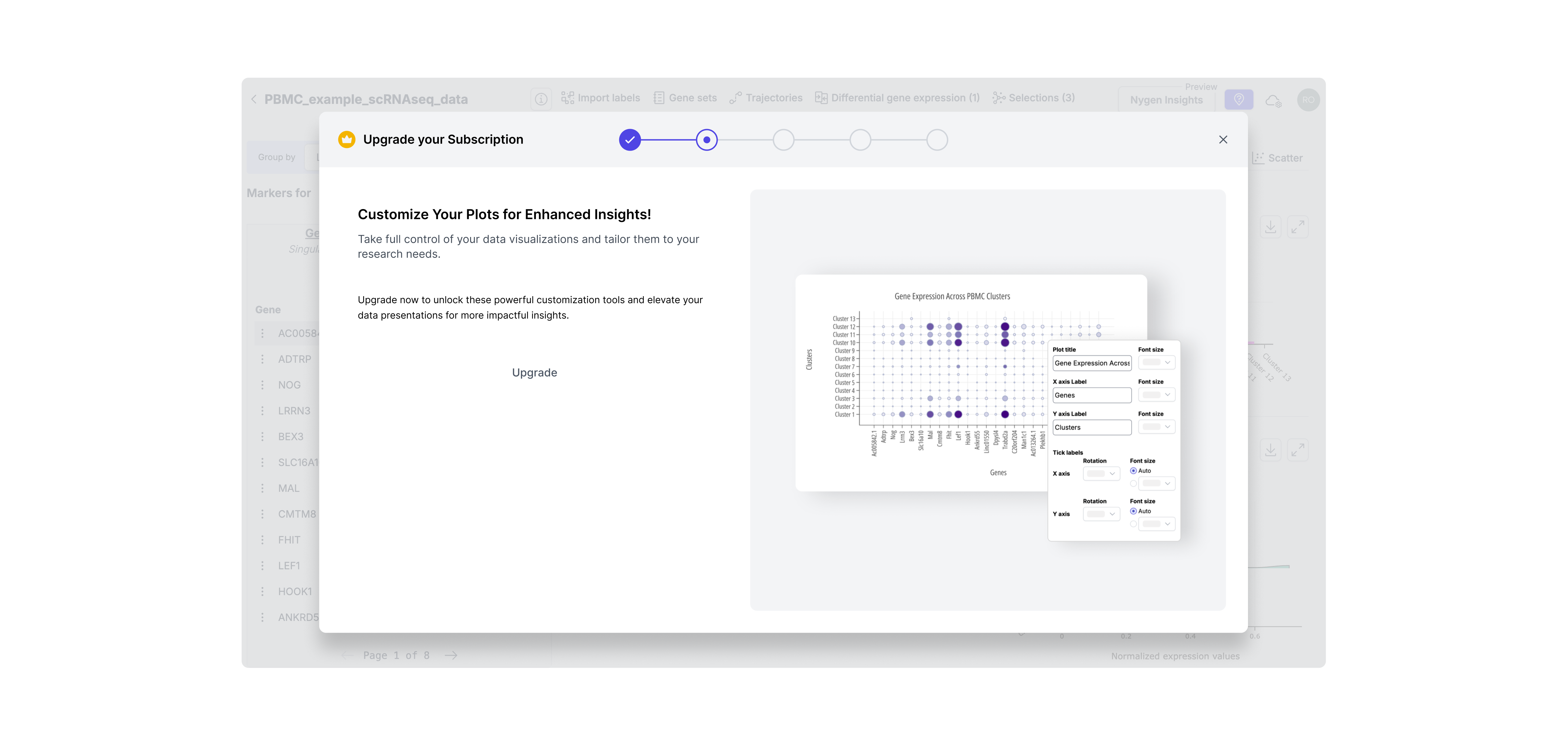
Iteration 1: Visual-Only Modal with Hidden CTA
Included a static image but no explanation of what features were gated. The upgrade button was small and secondary, and there was no way to return to the data (DotPlot) from the modal. -> Result: Users didn’t understand why they should upgrade — too subtle, no context, and easy to ignore.
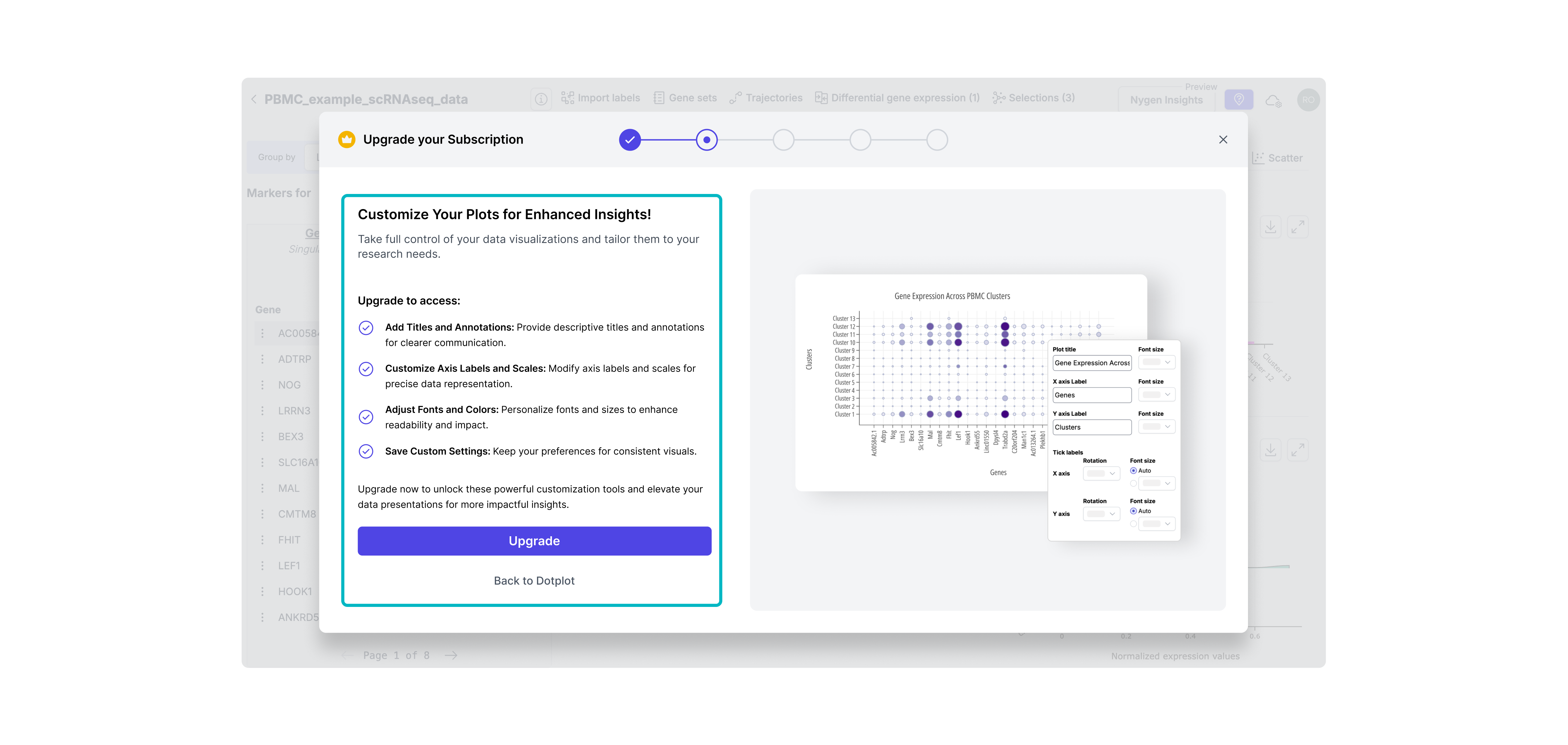
Iteration 2: Clear CTA + Basic Feature List
Made the CTA more prominent and added a brief bullet list of what upgrading unlocks. Still lacked context or emotional appeal. Result: Slightly improved clarity, but didn’t create enough motivation or urgency.
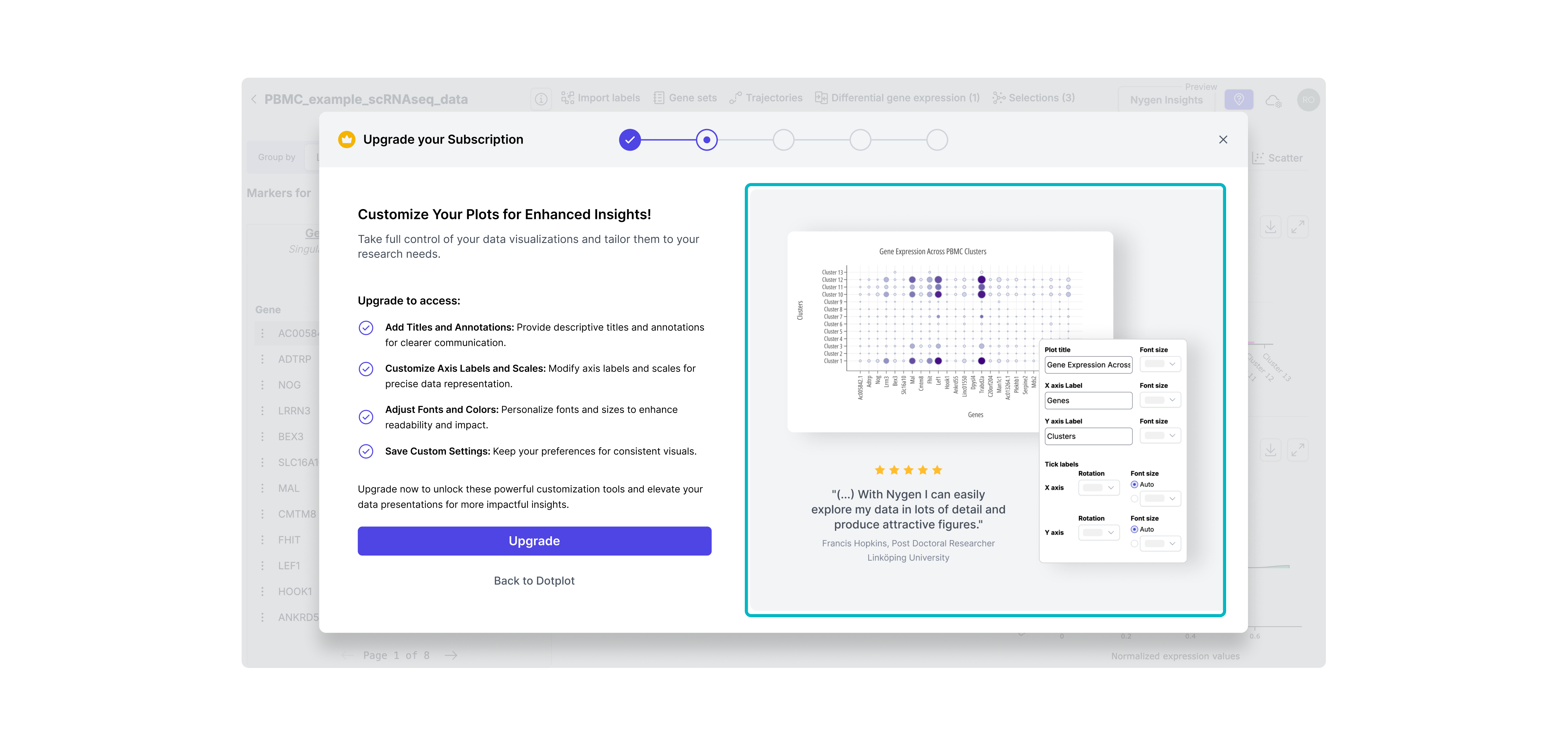
Iteration 3: Final Version - Visual Context & Value Framing
Combined clear CTA, detailed feature benefits, and a testimonial to boost credibility. Visuals matched the user’s context, reinforcing timing and value. -> Result: Felt more relevant and trustworthy, increasing upgrade intent at the right moment.
Clearer upgrade prompts and visible value signals helped more users recognize when to pay; right at the moment of need.
Users who signed up reached their “aha” faster: the guided upgrade path removed friction and improved onboarding experience.
By eliminating manual upgrade support, teams gained back time to focus on roadmap delivery and deeper work.
• Used event tracking (PostHog) to compare upgrade flow performance pre- and post-release.
• Tracked conversion and activation funnel changes week-over-week.
• Collected qualitative feedback from support and product teams on internal workload and user questions.
At the time, Nygen lacked in-app experimentation infrastructure. A/B testing wasn’t technically feasible, so we prioritized fast iteration backed by qualitative signals and behavioral data.

Although the contextual upgrade prompts were live, there was still room to evolve Nygen’s PLG strategy:
• Personalized upgrade triggers: Based on user roles, behavior patterns, or dataset types — to make prompts feel even more relevant.
• Usage-based trials: Offer limited-time access to a gated feature to spark upgrade intent.
• In-app onboarding improvements: Many users were unaware they were on a freemium plan — better onboarding could set expectations earlier.
• Deeper metrics instrumentation: With PostHog now in place, we could iterate faster with more confidence and track long-term impact.
This project reinforced several key lessons for me as a product designer:
💡 Don’t underestimate subtle friction: Users won’t upgrade if they don’t understand why, when, or how.
💡 Even soft paywalls need hard strategy: Modals should guide, not interrupt and must match user intent.
💡 Speed creates tradeoffs; clarity prevents waste: With limited time and data, crisp problem framing helped us prioritize and ship faster.
💡 Designing for growth is more than UI: It’s about timing, trust, and perceived value, not just pixels.
Interested in diving deeper? Take a look into my UX/UI accomplishments at Nygen Analytics.
How PLG & UX-Optimized Conversion Modals Increased Upgrades at Nygen
How a Multi-Page Website Boosted Nygen’s Traffic & User Engagement


.png)
.png)

.png)
.png)


.svg)